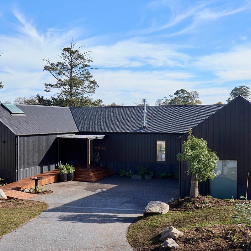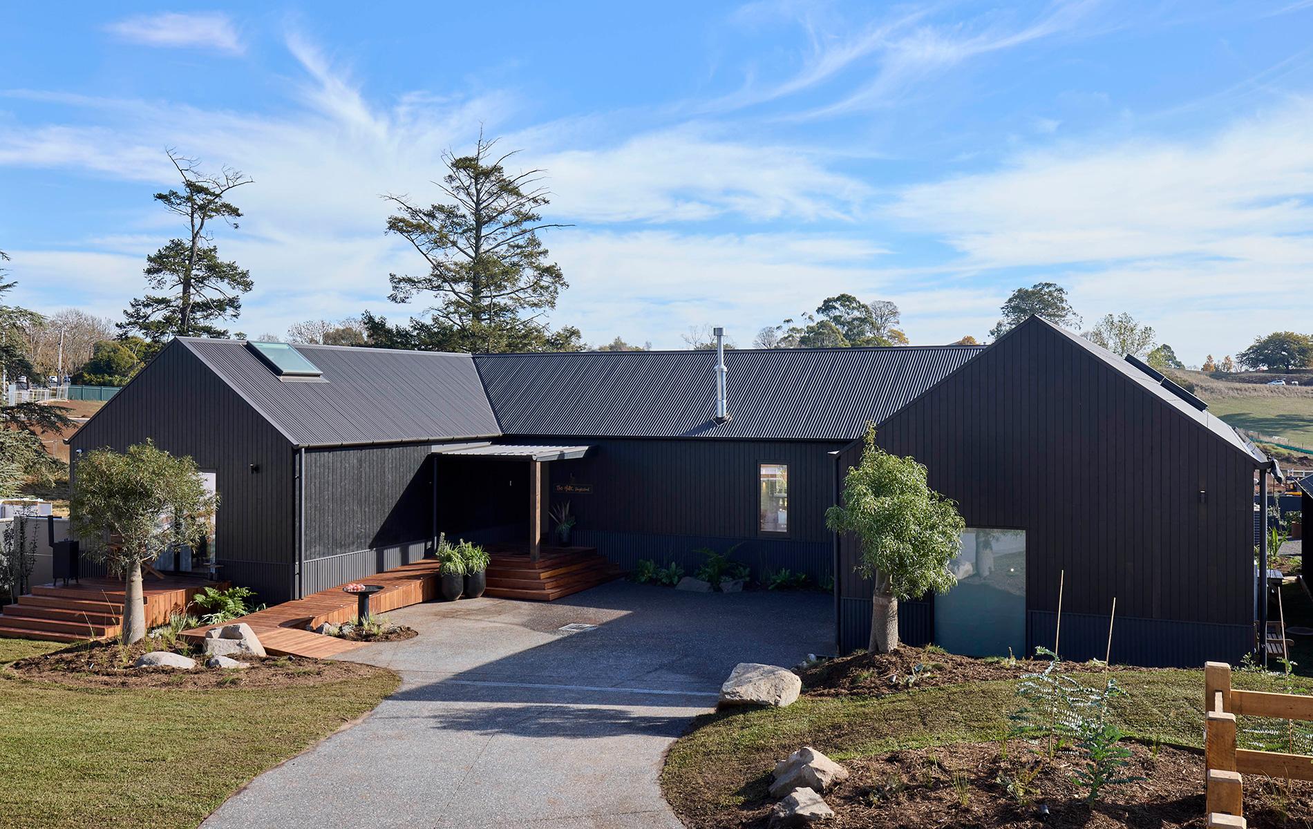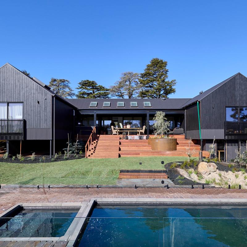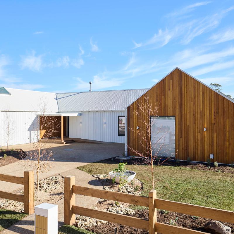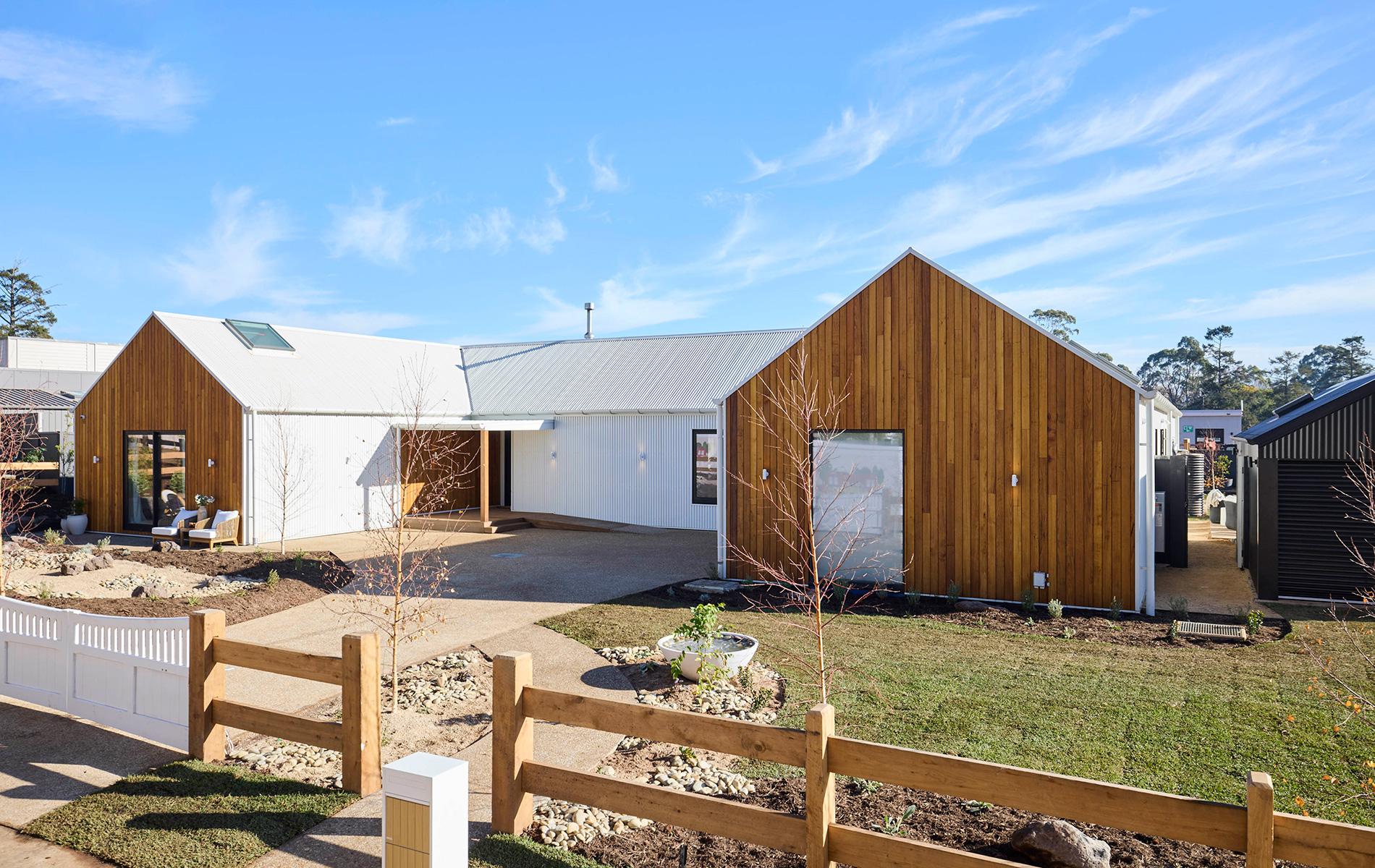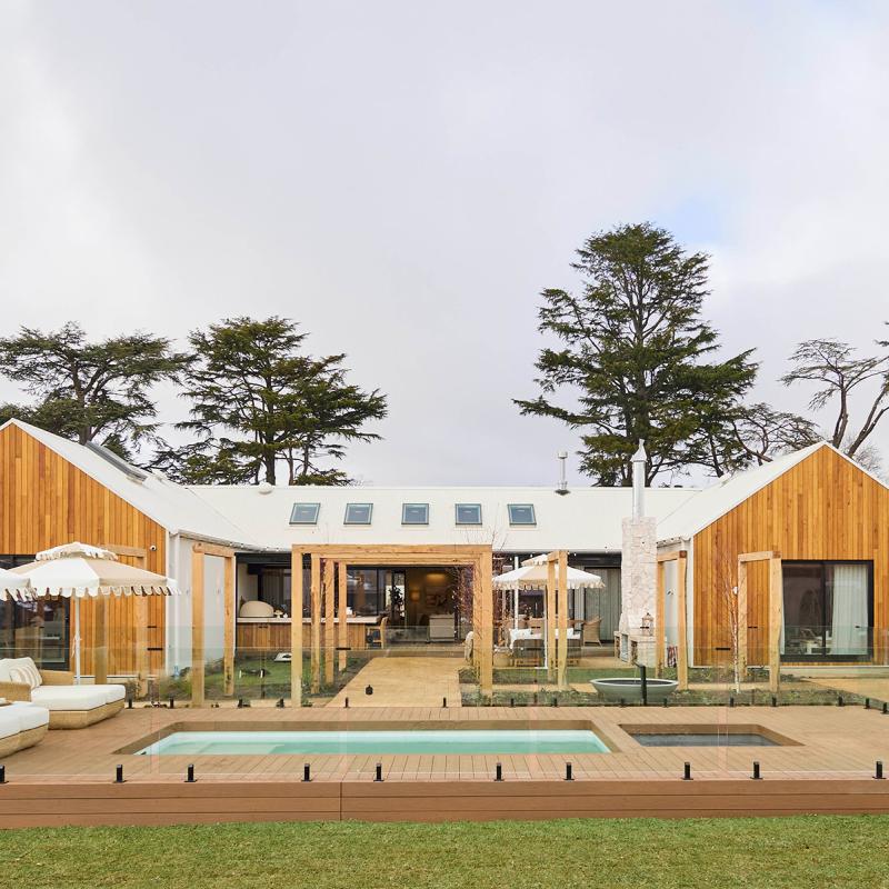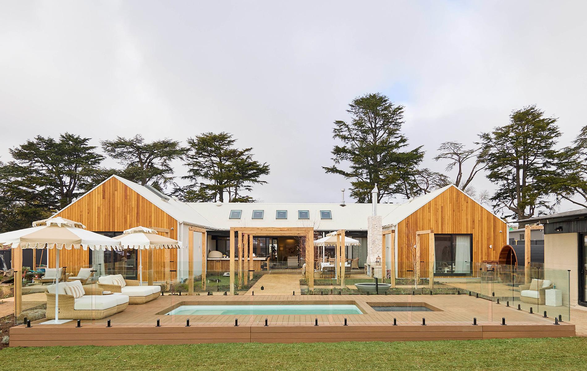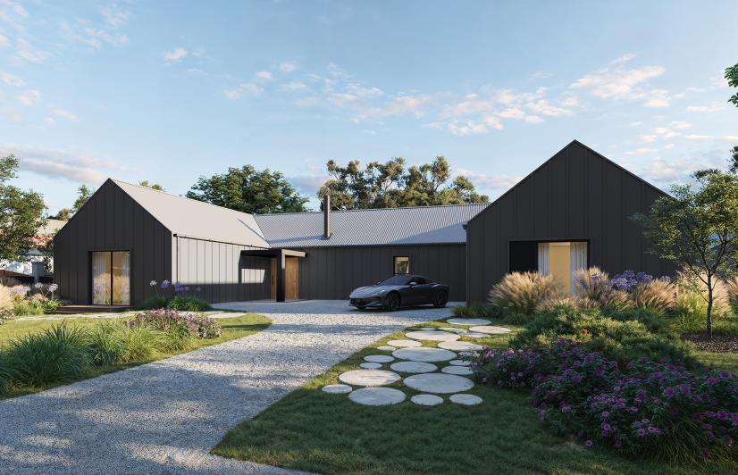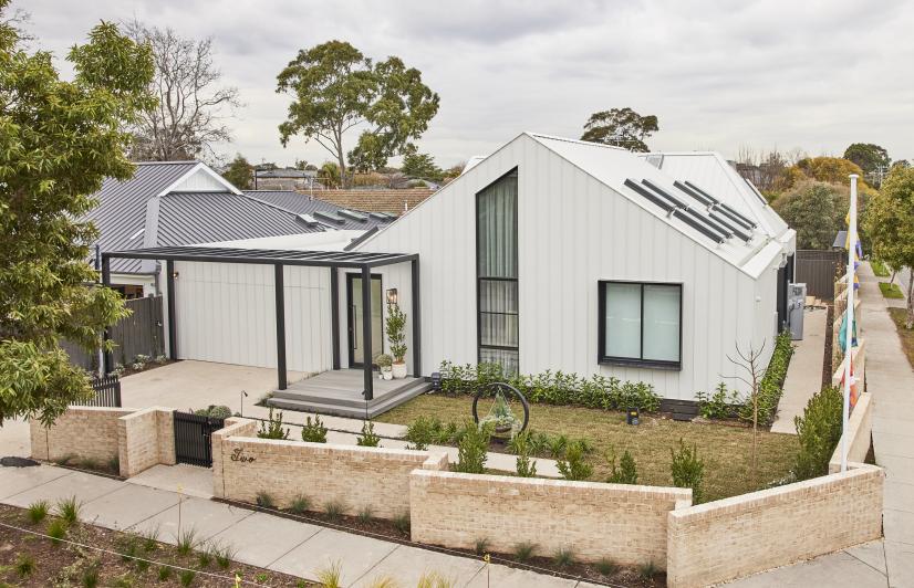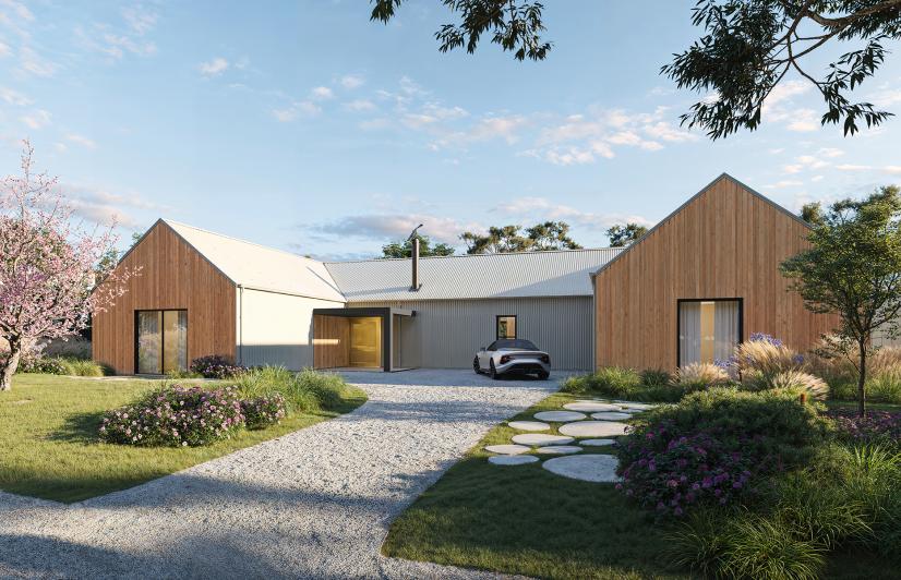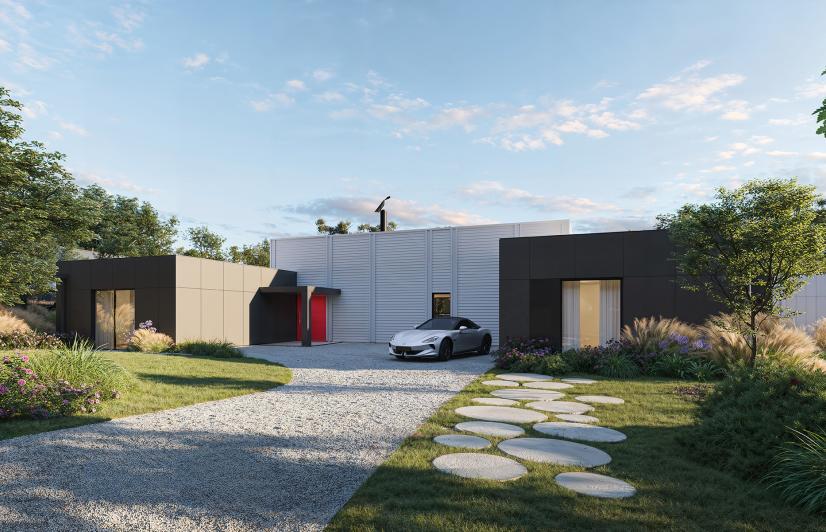

For the first time, each of the houses on this year’s Block were completely new builds - that presented a great opportunity to embrace the increasingly popular concept of “biophilic design”.
COLORBOND® steel design and colour consultant, Kaela Turgeon, helps explain biophilic design, what can do and how you might be able to achieve it. “Biophilic design is where your design choices are looking to connect to nature. That can be through the use of colour palettes, but it also can be used to make a connection through textures and natural materials”.
Blurring the line
It’s also closely linked to the design features of the house – big windows and wide open doorways that help blur the lines between inside and out. And it gets very blurry indeed this year in Daylesford, with each house overlooking large outdoor terraces, huge landscaped gardens, and spectacular natural surrounds (not to mention an extremely enticing pool or two). Done well, biophilic design strongly affects the way a place actually makes you feel. “Colour and design has an ability to be able to connect to someone... to evoke emotions out of people” says Kaela. “Nature is very calming. So it's trying to bring that calming feeling of nature inside and incorporate that into your design, using comfortable natural materials and colours”. Little things can have a big impact - think curved lines, wood and stone surfaces – even small water features to create a calming and sensory experience.
Bringing outside in
COLORBOND® steel draws the inspiration for its colour palette from nature - it creates a connection by complementing rather than competing with a property’s landscaping and surroundings. For those designing or building their own homes, one more way of blurring the lines between inside and out is also achieved by bringing some of the exterior colours into the house. And that's easily achieved as most paint companies match to COLORBOND® steel colours. This year, a warmer colour palette is very on-trend - COLORBOND® steel shades like Surfmist®, Dune®, Wallaby® and Woodland Grey® for example.
What’s right for you?
Interestingly, Kaela notes that the part of the country you call home can also impact your colour choices, with geographical location having a big influence - different states tend to lean more towards lighter or darker shades for their external renderings. “If you look at Tasmania... that’s a state that loves great colours and it’s totally appropriate for their landscape, just as much as paler is brilliant in Queensland where we’re quite adept in working with paler roof colours”. OK, so it’s all about finding what’s right for you. If you’d like some help, guidance or inspiration, visit the entire range of COLORBOND® steel, designed and tested for our unique environment in a range of colours that beautifully complement it.


