House 1: Where stylish monochromatic meets inviting warmth
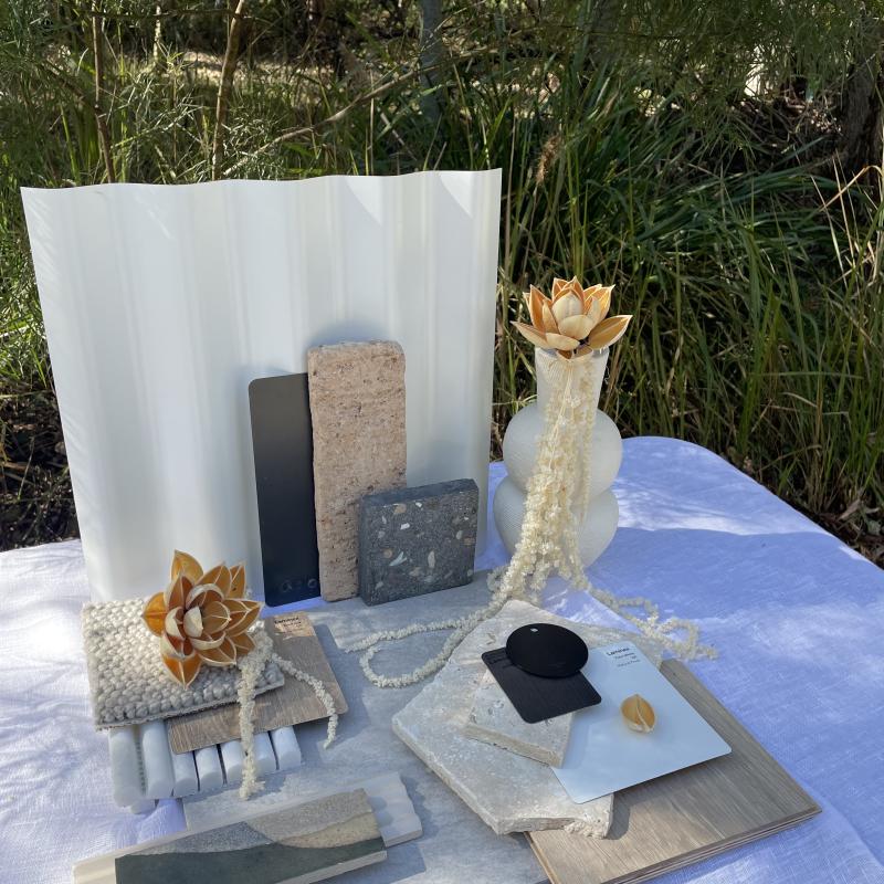
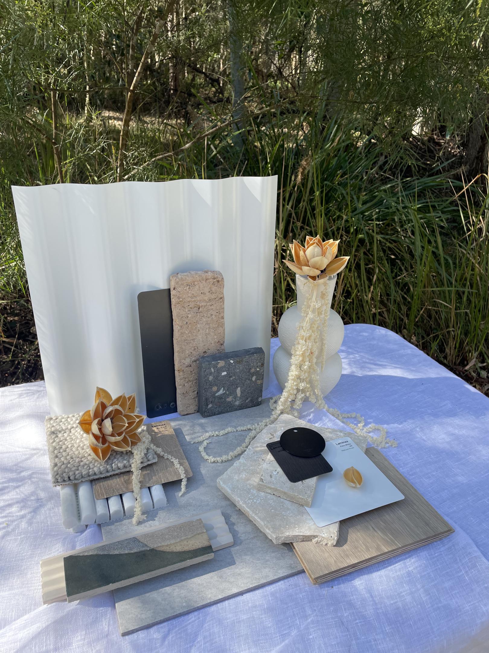
As The Block 2023 continues to rapidly take shape, Kaela Turgeon, our Colour and Design Professional, shared her thoughts around design possibilities for each of the five properties. In each case, she produced intricate flatlays that highlighted her thinking on the mix of colour, texture and appropriate materials. It’s a process that she recommends for anyone in the process of building or renovating. “It is important to have a balance of colours, textures and form to create a cohesive design scheme” says Kaela. “Having a well-balanced scheme makes sure that the design is both pleasing to the eye and creates a unified space”.
It’s also vital to create something that doesn’t feel out of place – one that complements the natural landscape rather than fighting against it. “It is important to not only establish a style that reflects your personal tastes but also takes into consideration the home’s surrounding environment”. Keeping things simple when it comes to design is another factor that Kaela emphasises: “By focusing on one or two feature elements you avoid a cluttered and chaotic scheme and instead creates a scheme that is both timeless and inviting”.
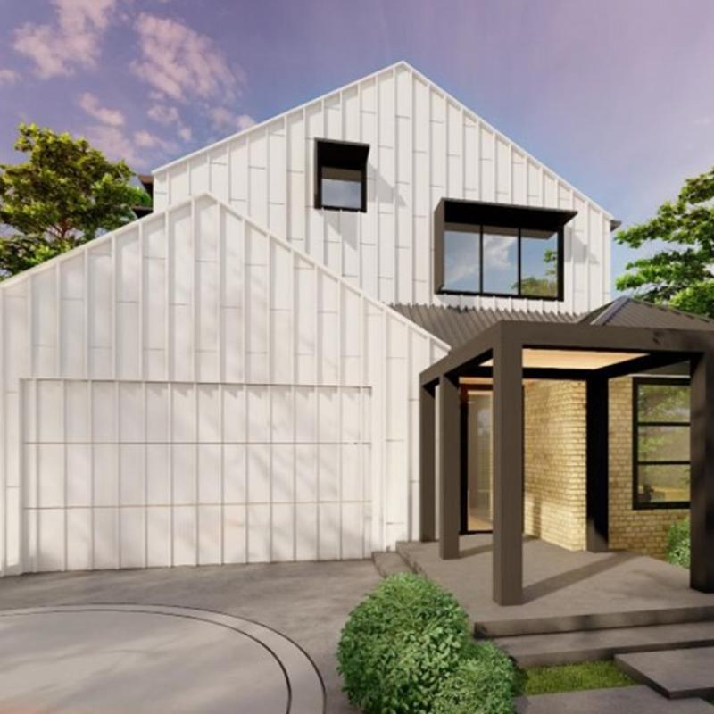
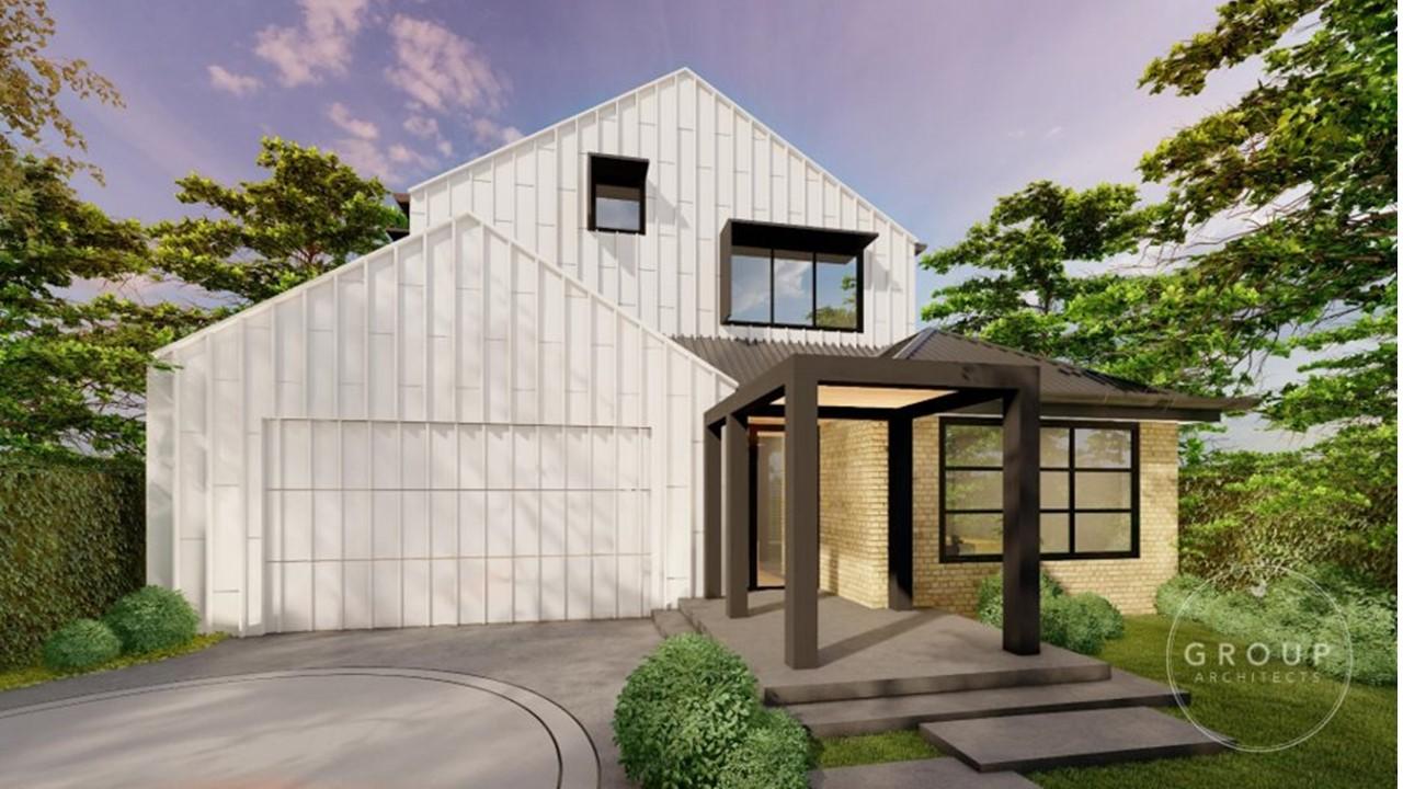
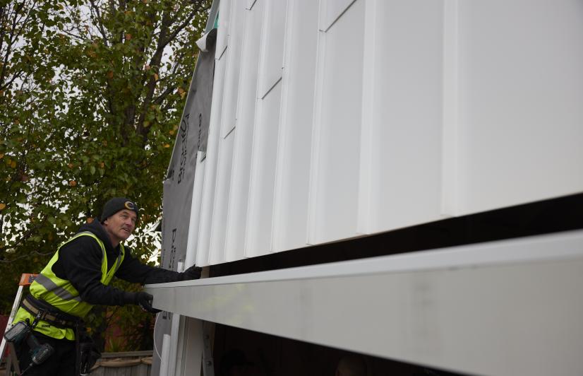
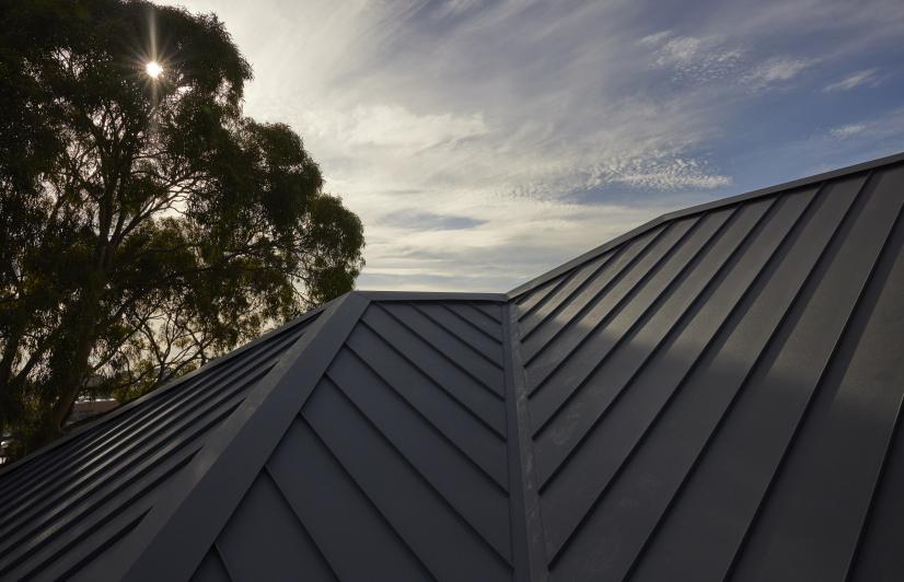
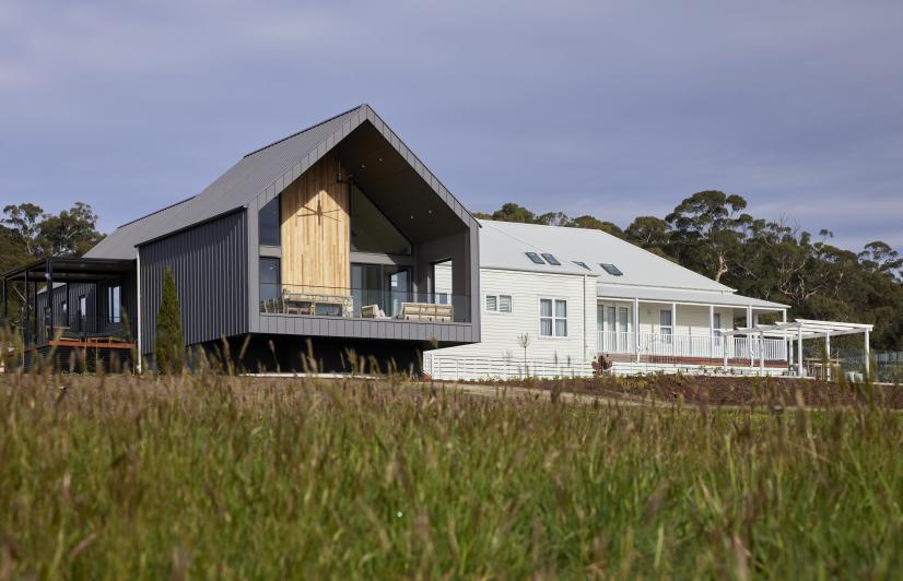
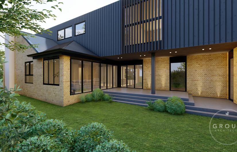
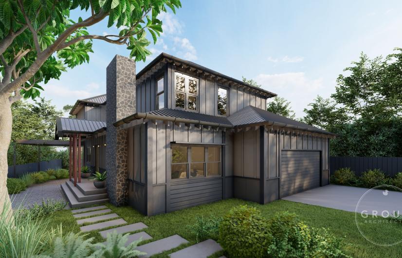
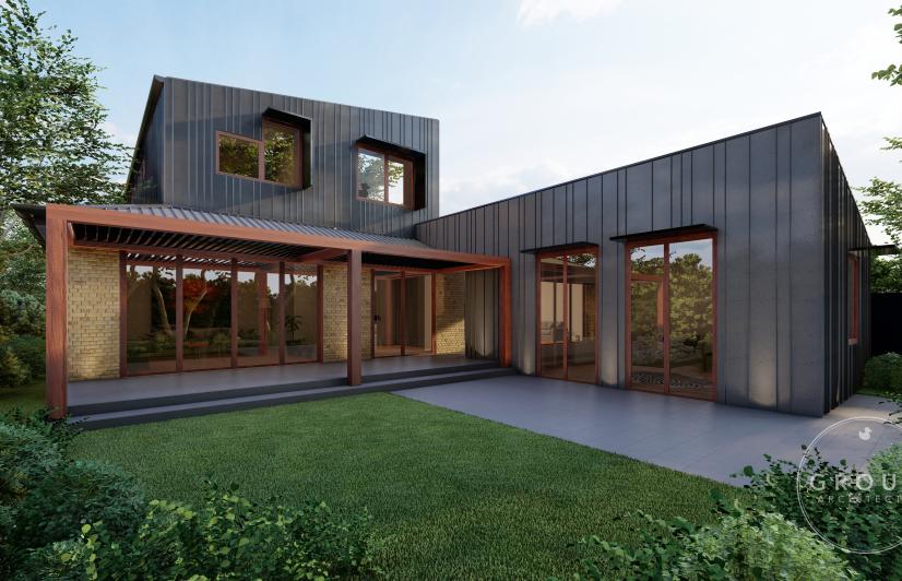
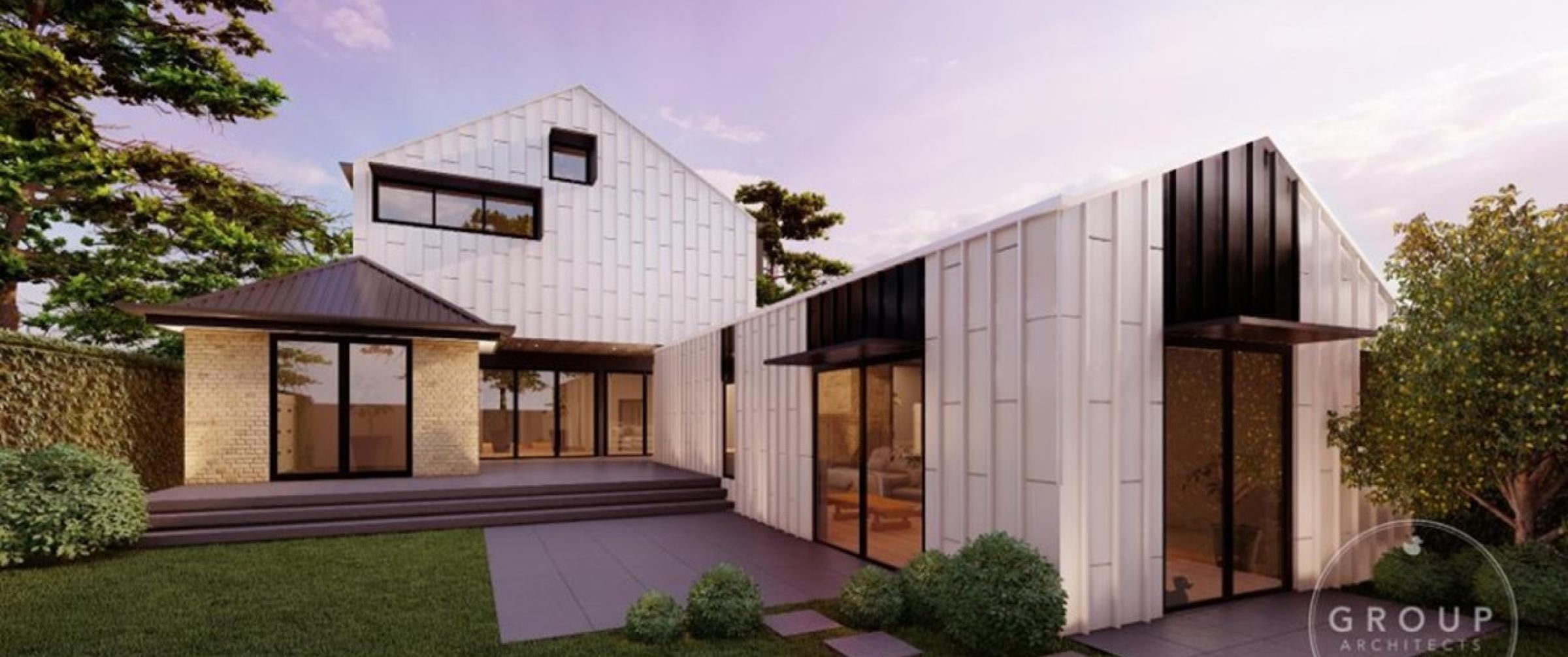
When it came to House 1, Kaela was a big fan of the use of Dover White™, one of the striking new COLORBOND® steel colours that is appearing on The Block this year. This clean, crisp, bright white colour makes a strong, monochromatic statement, drawing strongly on the Melbourne bayside location while hinting at its suburban roots. “House 1’s façade has a modern coastal feel, but with elevated profiles and materials that pay homage to the coastal environment and the home’s history with the repurposed warm toned bricks”.
Image caption: A modern coastal feel with a monochromatic twist.
Kaela believes House 1 will be a strong contender this year. “The A-frame design with strong lines and a crisp, clean external colour palette is very much on trend and will appeal to a lot of people with its elegant design”.
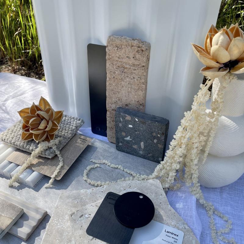
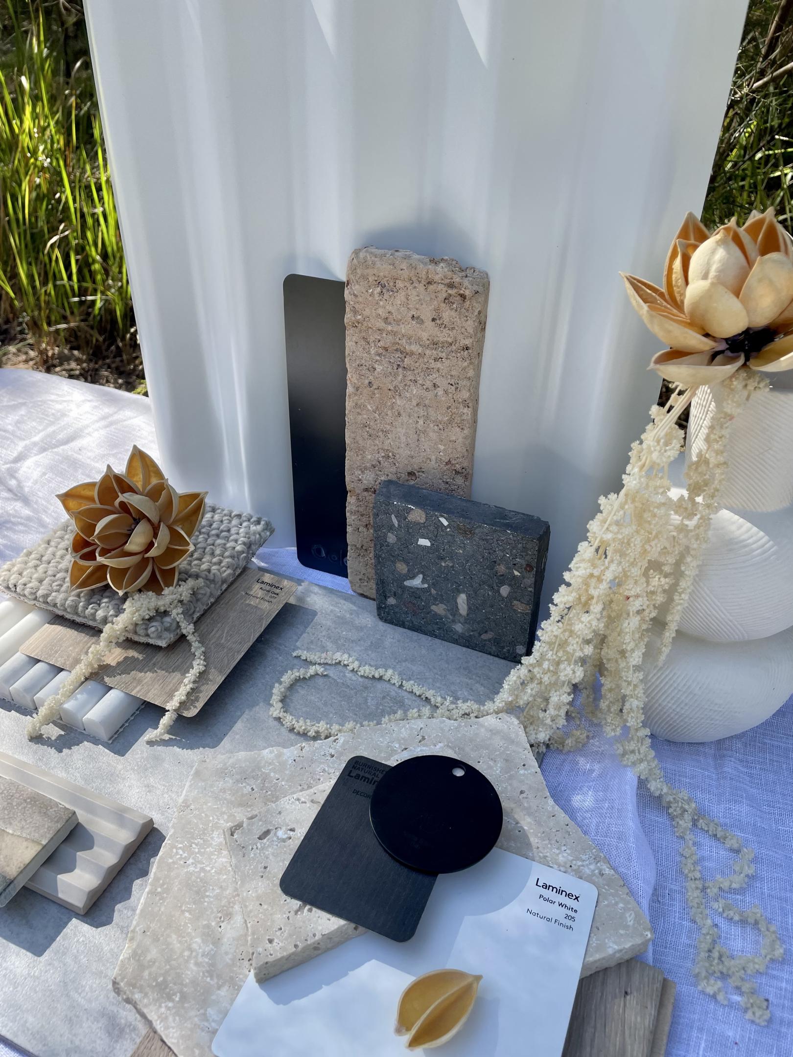
She’s recommending a soft, warm internal scheme to evoke a welcoming, homely feel, something that will only add to prospective buyers’ desire for the home. Her flatlay for House 1 brings this thinking to life in a distinctive combination of elements, with a respectful nod to a little bit of history. “I wanted to create a vertical flat lay that draws your eye upwards just like your eye is drawn upwards by the vertical cladding made from COLORBOND® steel in the colour Dover White™. I loved the sense of warmth this home evokes. I wanted to make this the most visually dominate element of the flat lay by using texture and colour. Taking inspiration from mid-century design seen in the 1950s, I used materials that emphasised the clean lines, muted curves and minimalist design all seen in that era”.
For Kaela, it’s a colour palette that can be neatly summed up in five words: “Modern Coastal, Elevated, Linear, Calm & Cosy”

