House 3: A darkly elegant contender
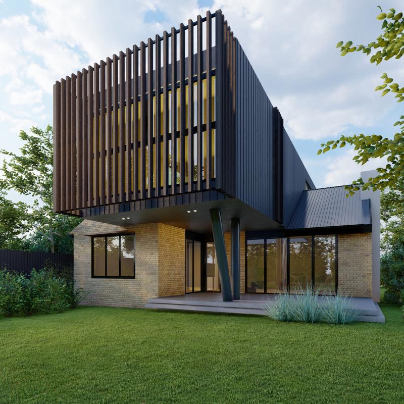
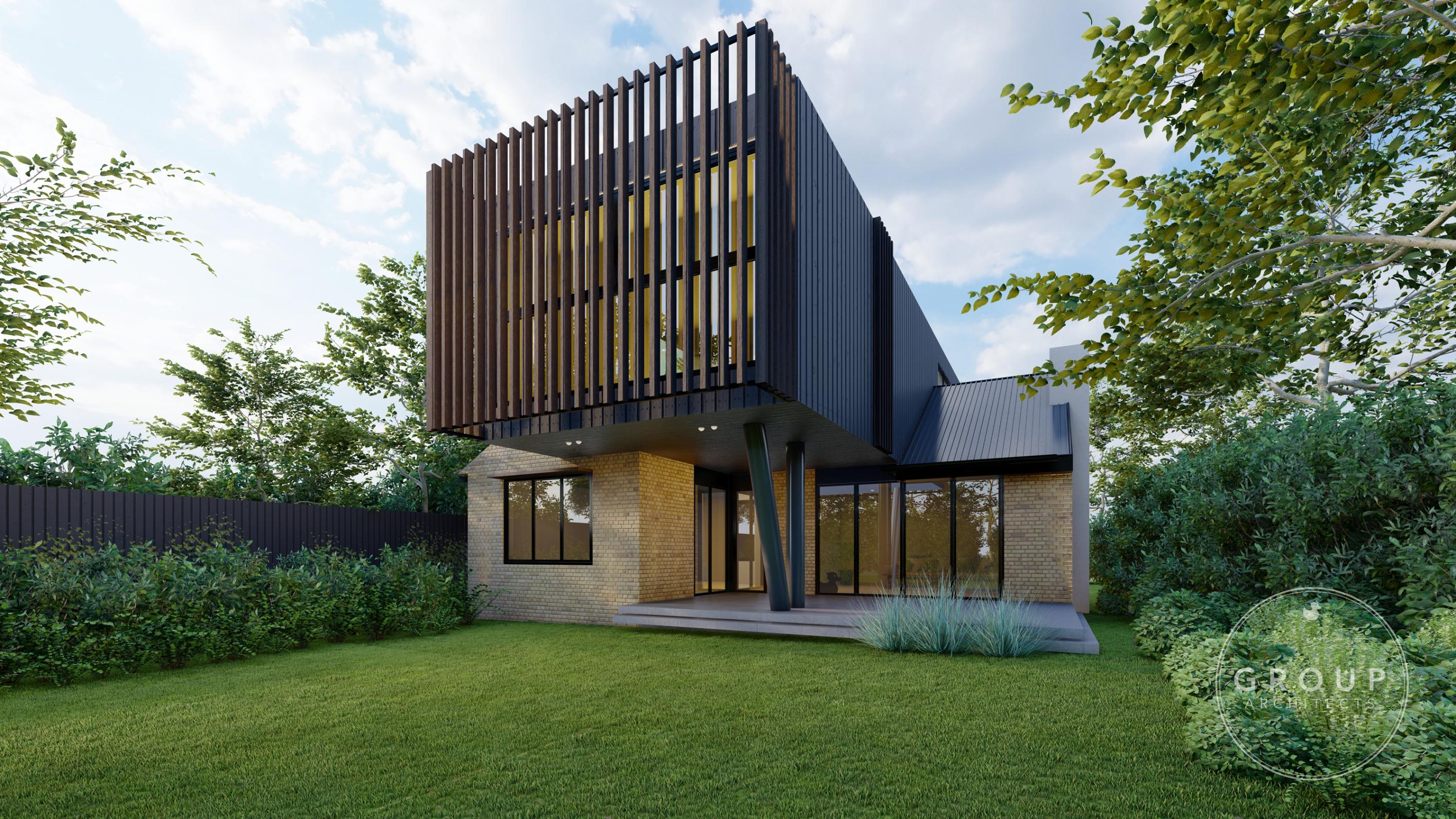
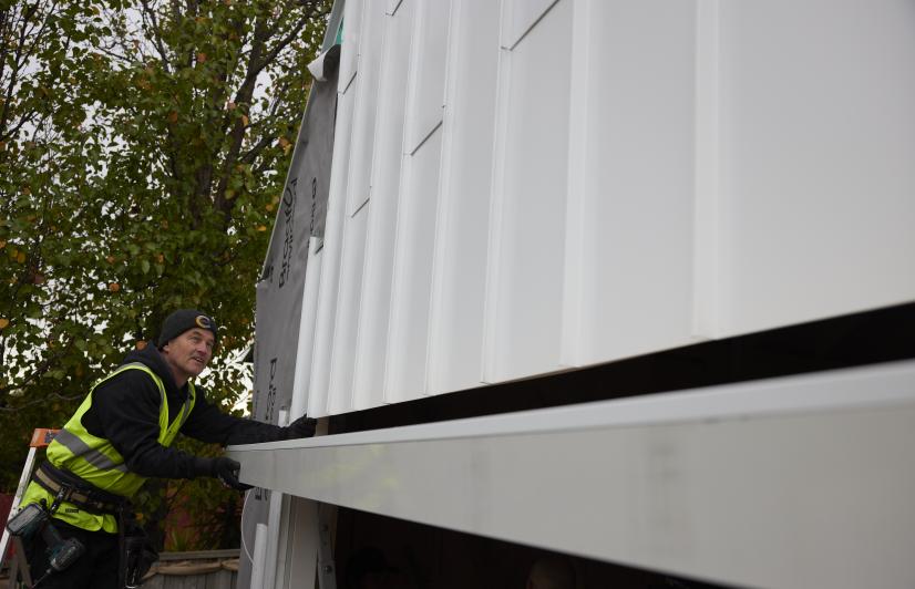
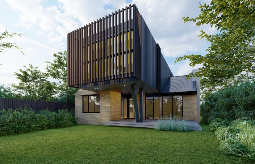
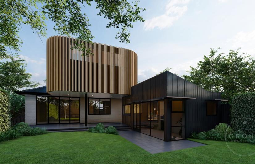
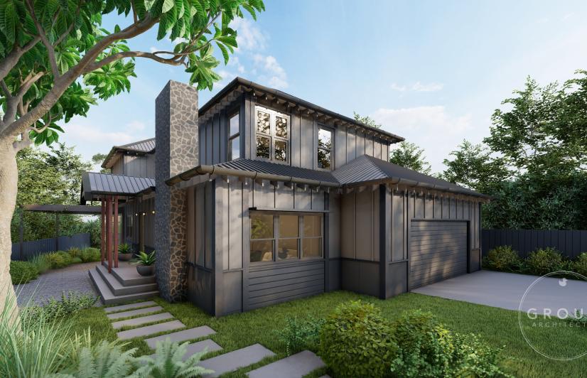
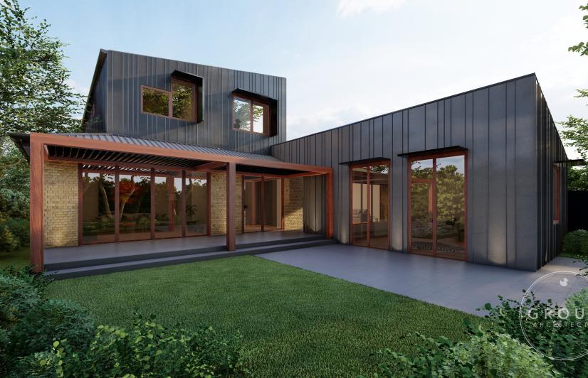
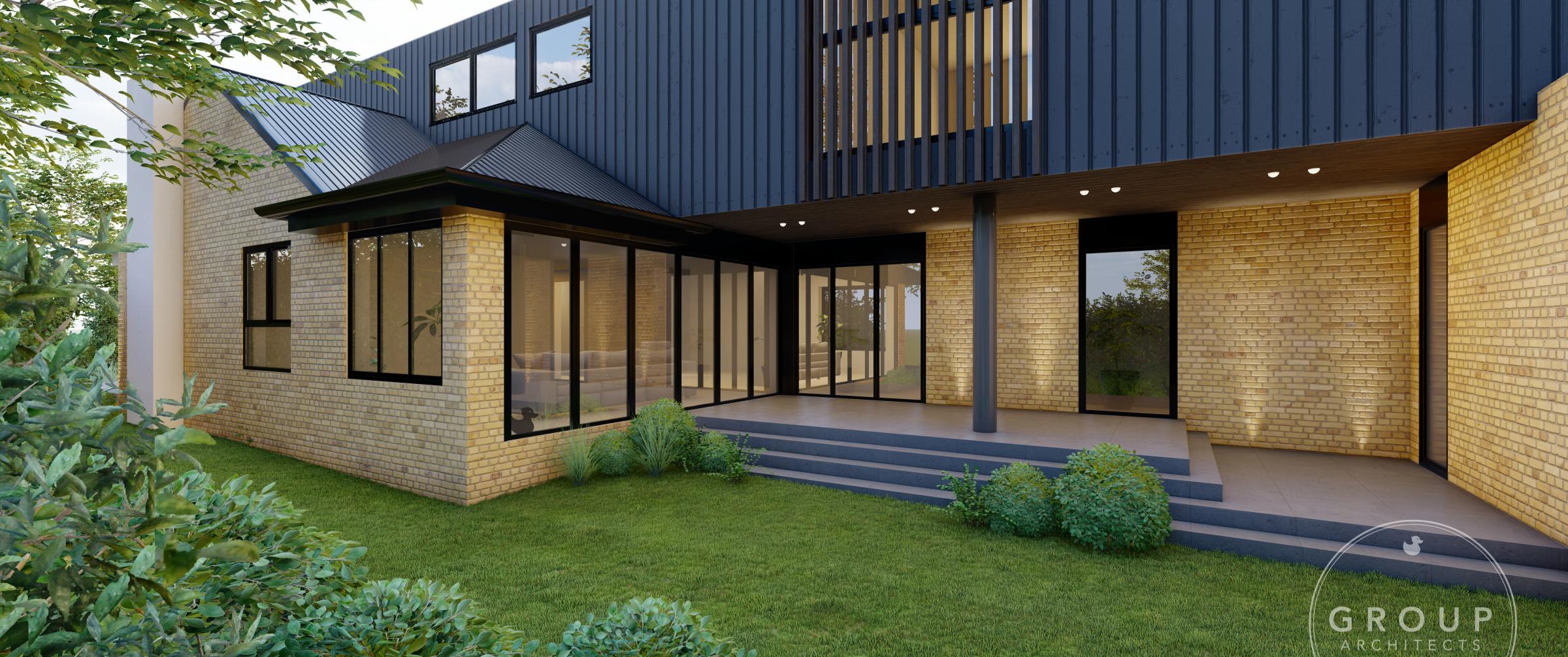
House 3 sits as a commanding presence on the corner position of this year’s Block. Our Colour and Design Professional, Kaela Turgeon, shares her thoughts on how to best bring the property to life from a design perspective. Its exterior already makes a strong colour statement, with a dark upper level and lighter colours below. Kaela explains the impact that this combination has: “By using a dark colour on the upper level, it draws your eye to the architecture element of the charred timber cladding. The depth in colour is then balanced on the bottom level through the use of dark trims in the windows and doors. Using a light-coloured brick on the bottom level helps give the high contrast needed to emphasise both the Japanese charred timber cladding known as Shou Sugi Ban and dark trims”.
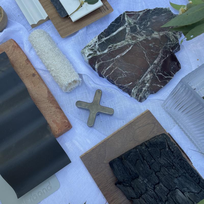
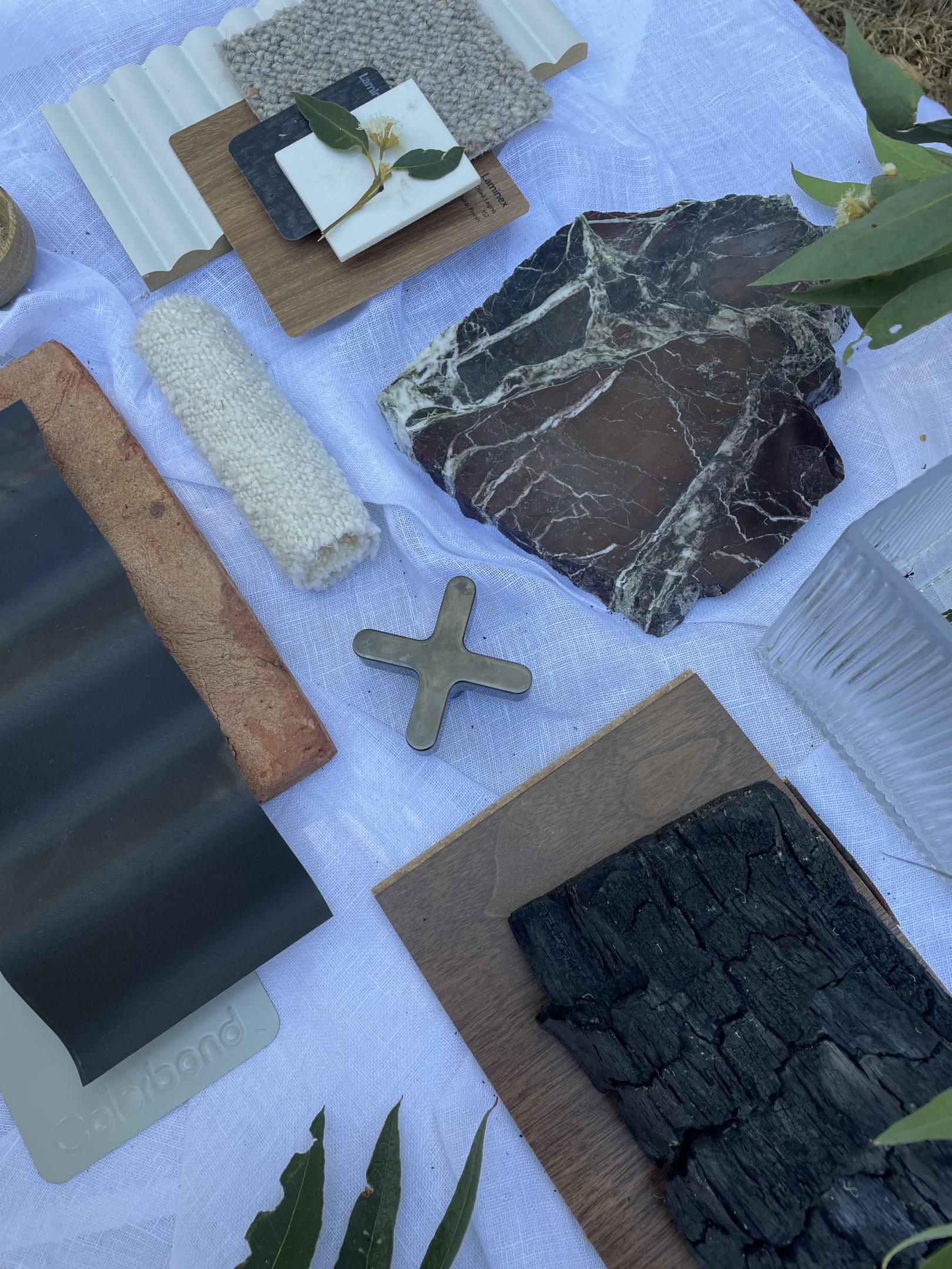
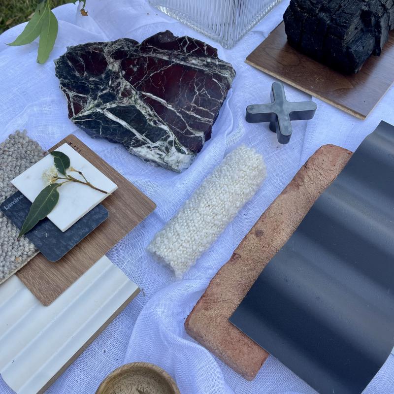
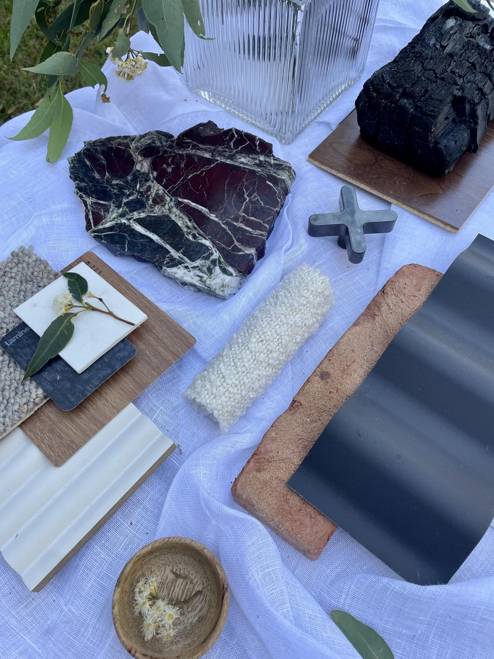
Image: Organic, elegant and tactile with the use of Japanese charred wood, Shou Sugi Ban, and shiny statement pieces.
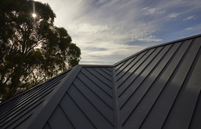
Kaela advises taking these external colours through to the interior, creating a unique and enticingly warm environment. “I want to take the warm tones through from the brickwork, with dark internal accents inspired by the dark colours seen on the Shou Sugi Ban cladding, windows and door trims”. As with the other houses, Kaela’s design and colour recommendations came together in a detailed, large-scale flatlay. “I began with the strong design elements of the home being the Shou Sugi Ban charred timber and Levanto marble which is perfectly complemented by the use of COLORBOND® steel Monument®. I can see a true link to nature within the colour selection - it allowed me to conceive a more organic palette. The scheme is very tactile, so I wanted a flatlay design that allows you to see each material in a larger format to get the full impact”.
Asked for a quick summation of the colour palette she has presented, Kaela shares these five words : “Organic, Elegant, Japanese Inspired, Tactile, Moody”

