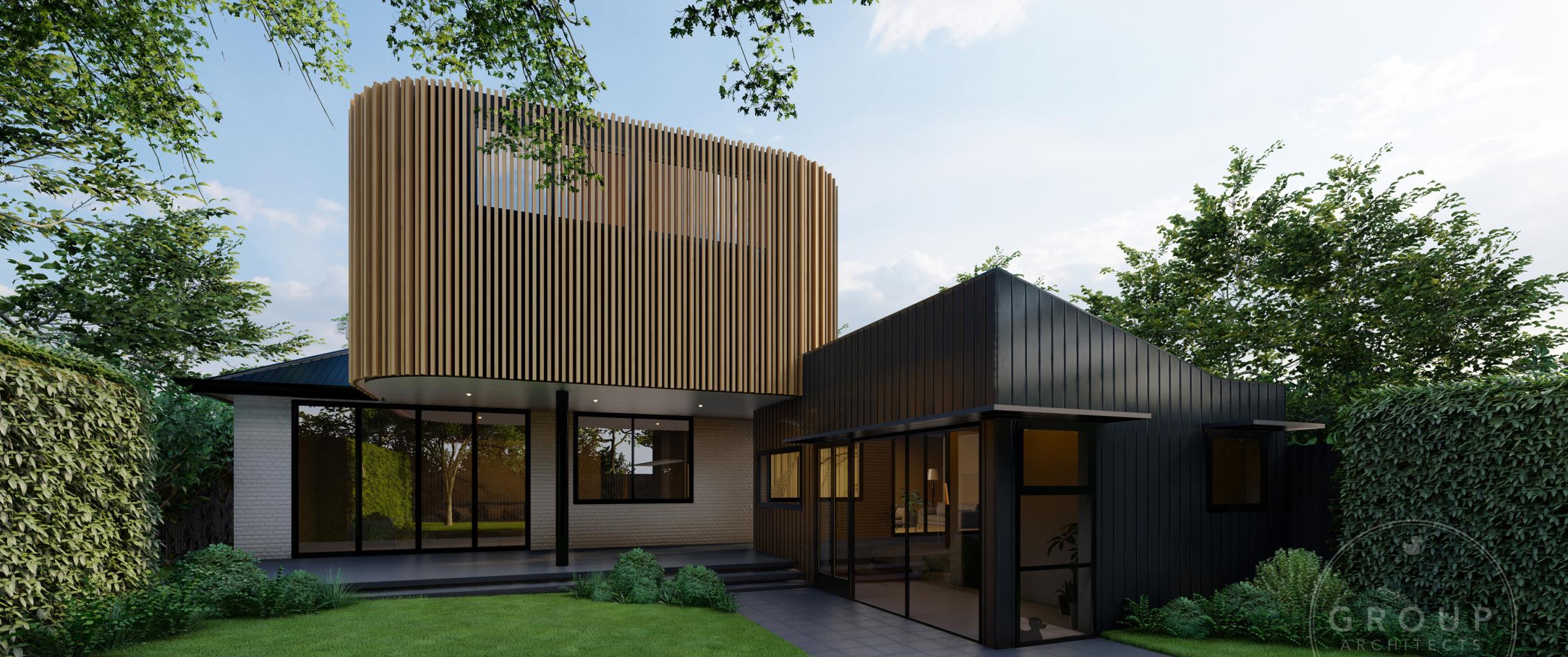
House 2: Mixing things up
Colour and Design professional Kaela Turgeon created her own colour and design flatlays for each of the five houses on this year’s Block.
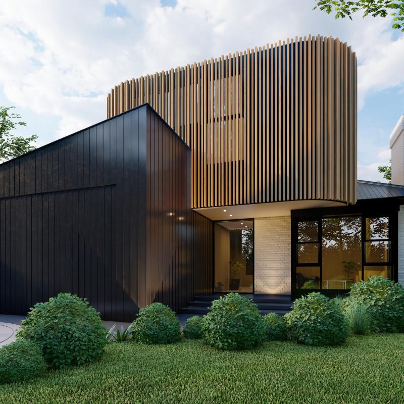
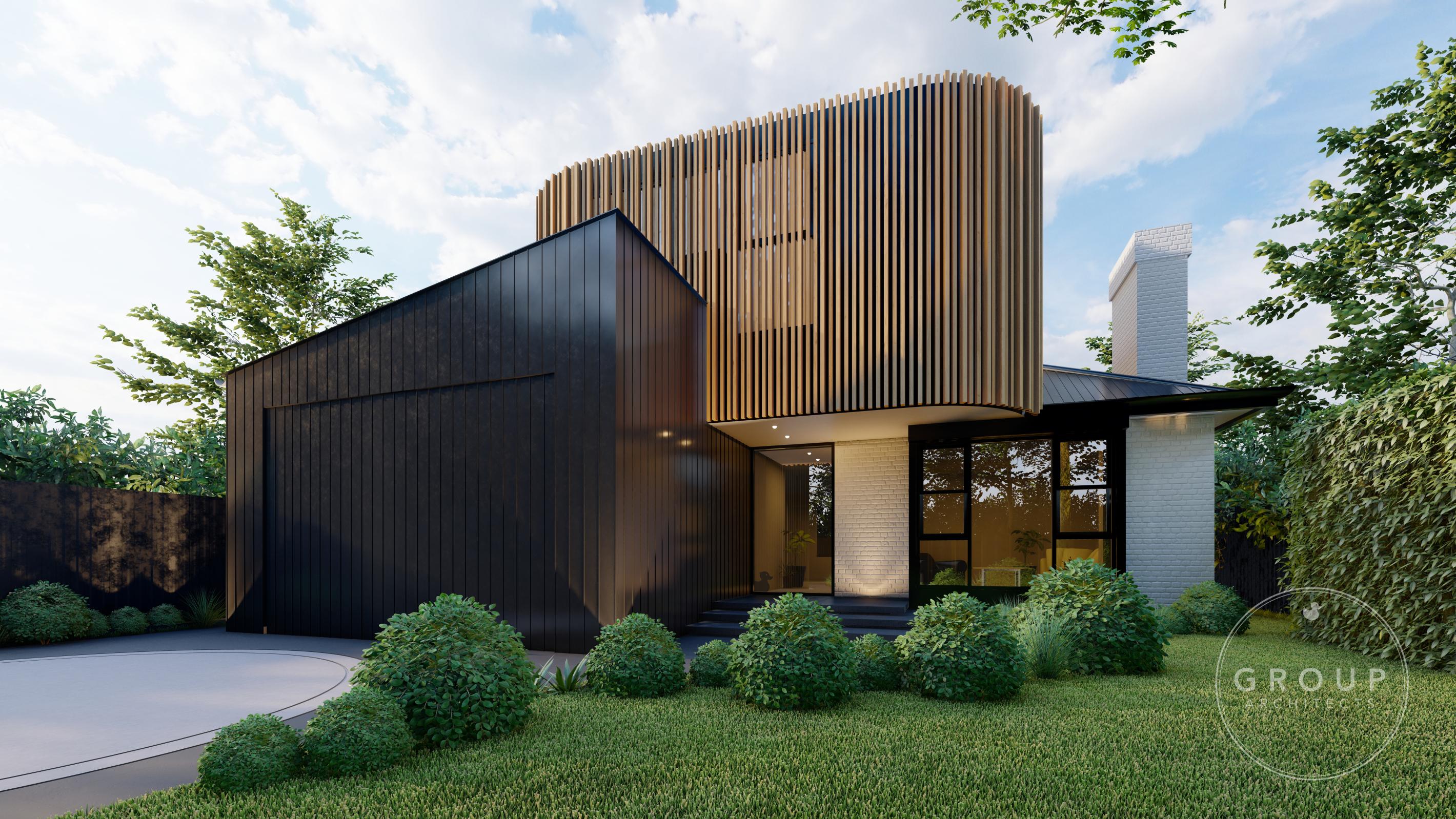
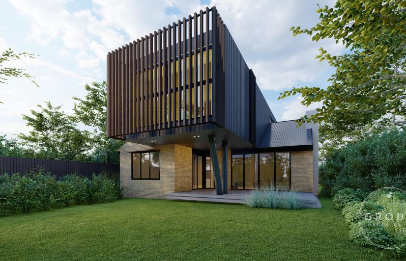
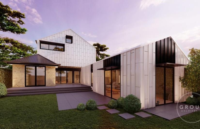
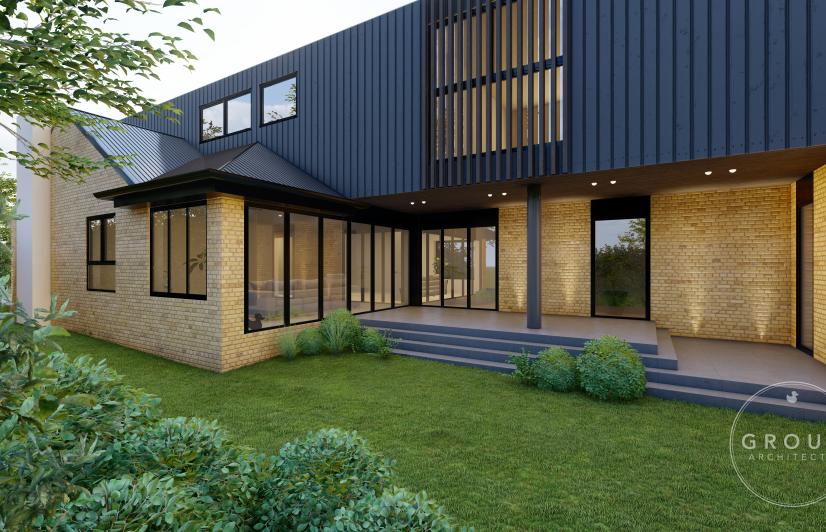
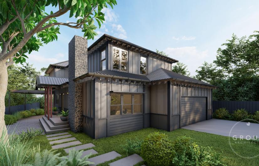
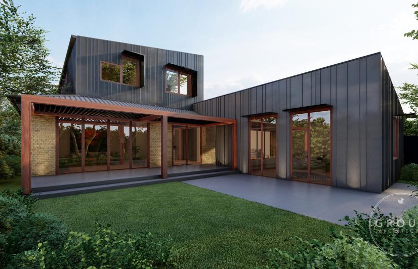
House 2 embodies a classic mix of materials and colours – it is that mix that very much inspired Kaela’s thinking. “House 2’s design concept is focused around a modern version of mid-century design both internally and externally. Mixed materials were a huge influence in mid-century design including the use of mixed shapes like linear and curved lines”. Kaela also used this link to the past when choosing colours, with the use of rich, bright and earthy tones also widely used in mid-century design.
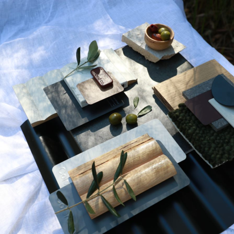
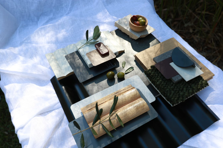
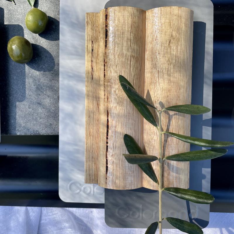
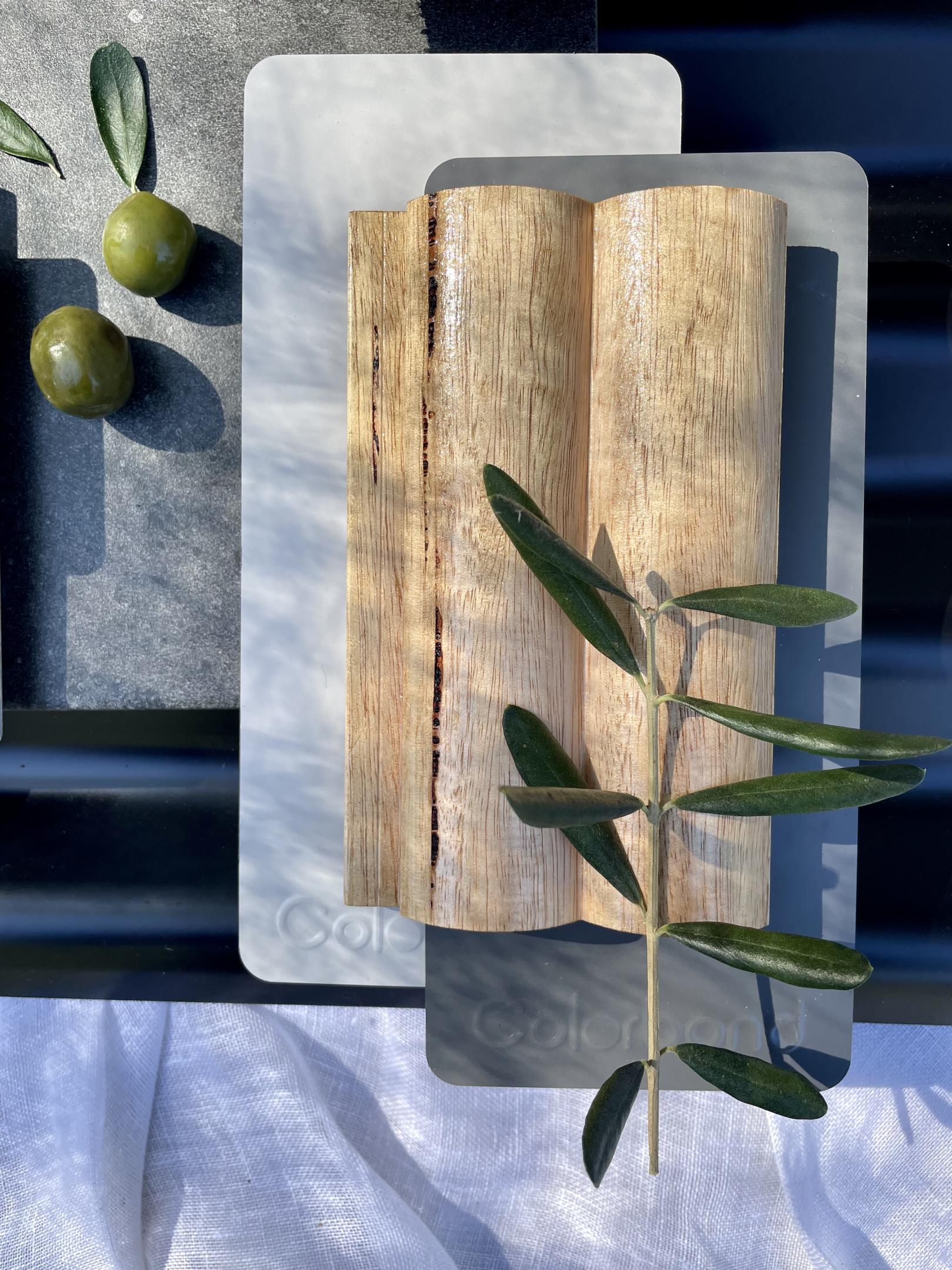
Image Caption: Emphasis on a luxe and modern feel with a mid century undertone amidst the use of curves and rich earthy tones.
Her stylish flatlay for House 2 takes a lot of inspiration from this distinctive design era: “There’s the use of curved wood, earthy tones like olive green and rich burgundy, and sleek minimalistic elements. I wanted the focal point to be the mixed materials of timber, COLORBOND® steel and bricks and how they work together to create a visually appealing scheme”. While being inspired by some elements of design history, Kaela wanted to make sure it was definitely a modern take on it. “When creating this flatlay, I wanted it to emphasise a luxe and modern feel with mid-century under tones”.
Succinctly summing it up in five well-chosen words, she describes it as “Mid Century Modern, Curved, Sleek, Commanding, and Luxe”

