Darren Palmer has shared with us his tips to create a colour palette that works for your project. In this article he discusses important considerations such as ensuring you develop a scheme that works with the surrounding environment, where you can find inspiration, and how to put everything together.

CAPTION: Darren Palmer and COLORBOND® steel’s, Christine McCoy
By Darren Palmer
People often ask me, ‘What’s the right colour palette for the exterior of a home?’. It’s a bit like asking, ‘What’s the right sort of music or the best type of art?’. There’s always an element of subjectivity with any aesthetic challenge, but don’t worry, there is a way to get to the right answer for you. Simply work backwards through these questions to reveal the essential factors that will help inform your decision.
Is it a renovation or new build? In either instance you’ll need to ask whether this is to be your forever home, or something to live in for a short period; say up to 5 years, before eventually selling, or a house ready to market as soon as it’s complete.
If you’re going to sell now or within the next 5 years, an easy thing to do is look around your local area and understand the aesthetic factors common to homes that sell quickly. These could be contemporary colour schemes and materials, on-trend styling details, or popular architectural and lifestyle features. Learning from in-demand homes can give you clear inspiration for a palette that will help you successfully market your own.
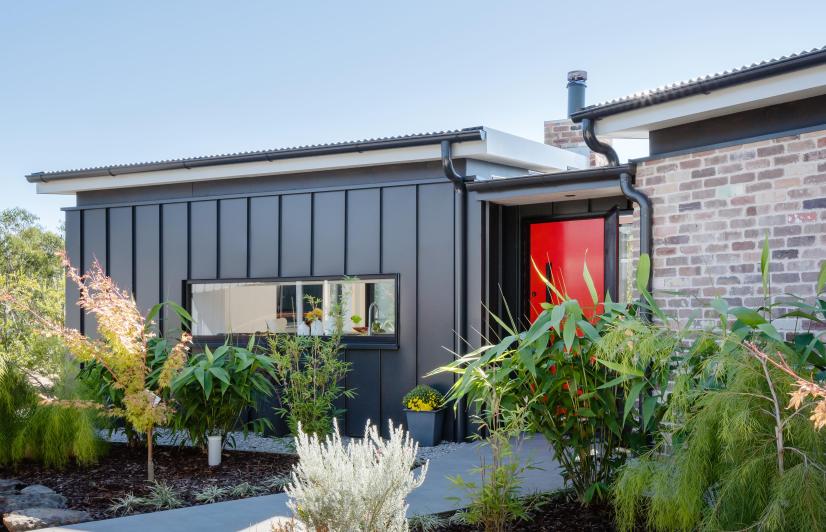
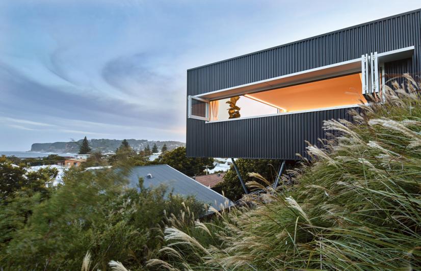
CAPTION: COLORBOND® steel roof in Monument® Matt
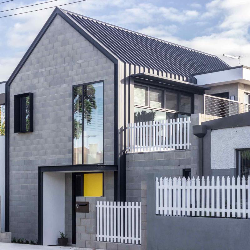
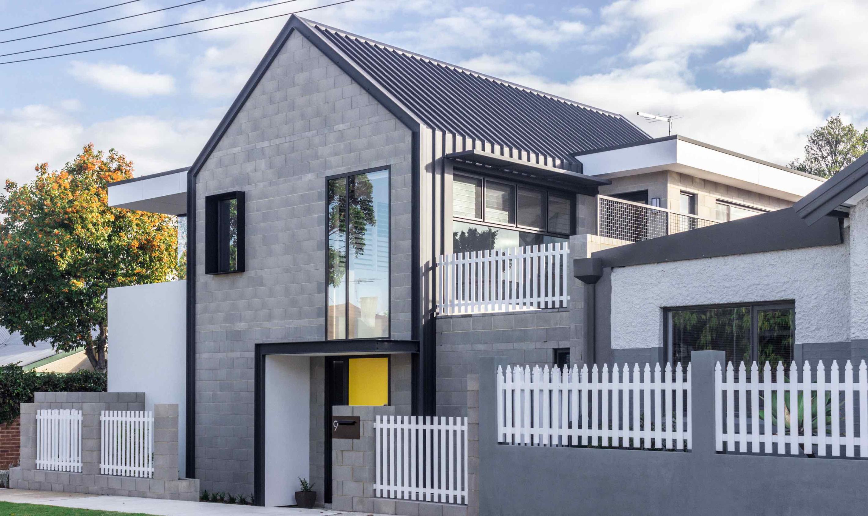
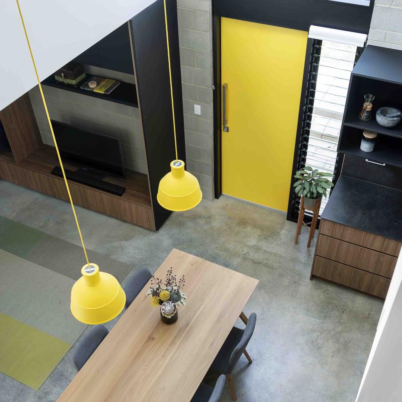
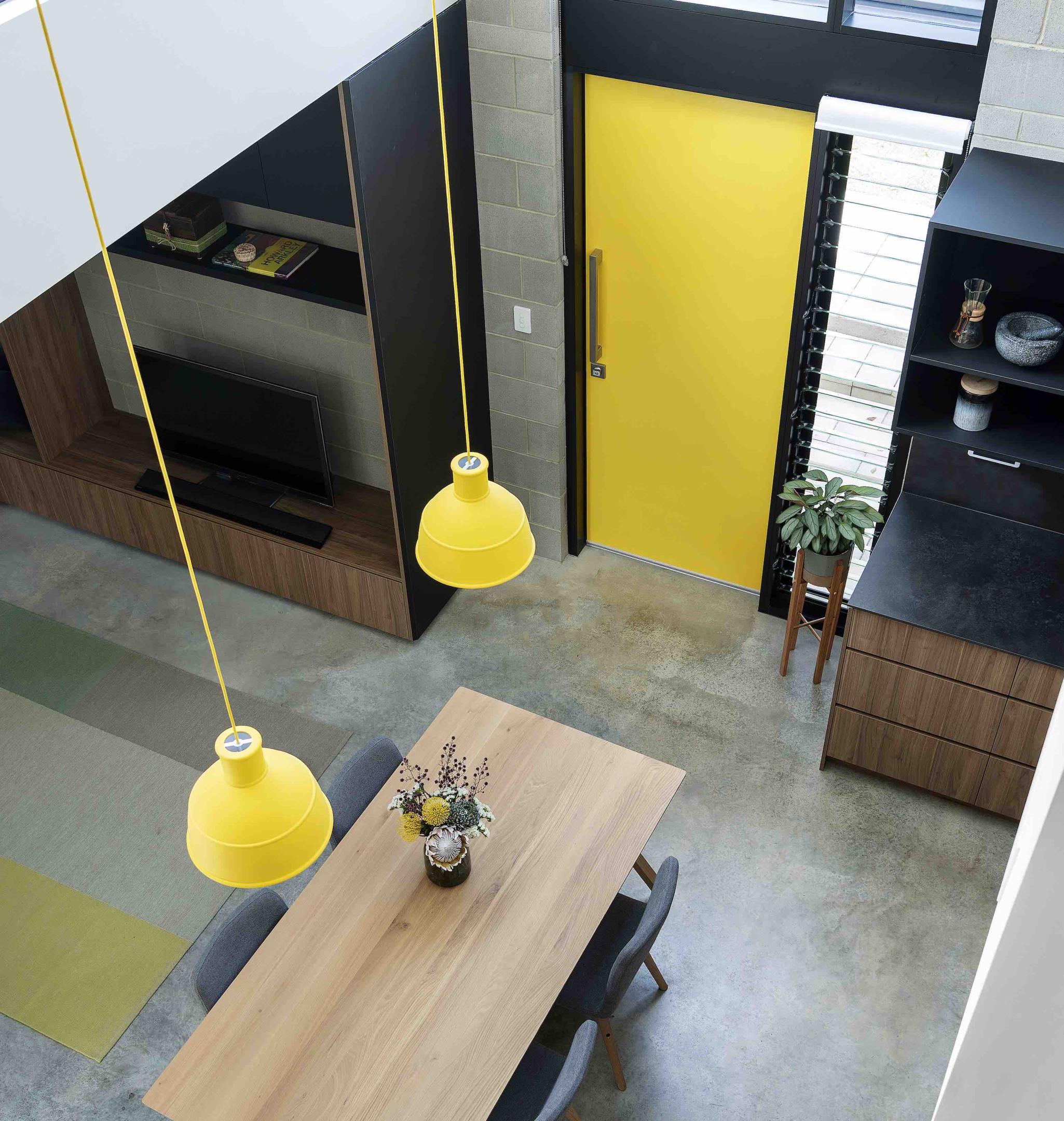
Dollhouse 2.0 by Aura Design Studio (pictured above) is located near various cultural hubs and this vibrancy is reflected in their contemporary but colour palette. Combining a minimalist monochrome colour scheme of grey, white and black with brilliant pops of yellow gives the home a beautiful flow from outside to in, and creates a distinct personality on the street.
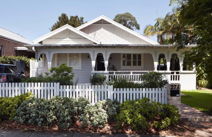
Even if you intend to keep the home happily forever after, it’s still worth considering a palette that works well in your area. After all, we never know what the future holds, so unless you have a strong aversion to the local look, it can be wise to hedge your bets and create a property that’s always going to be easier to sell.
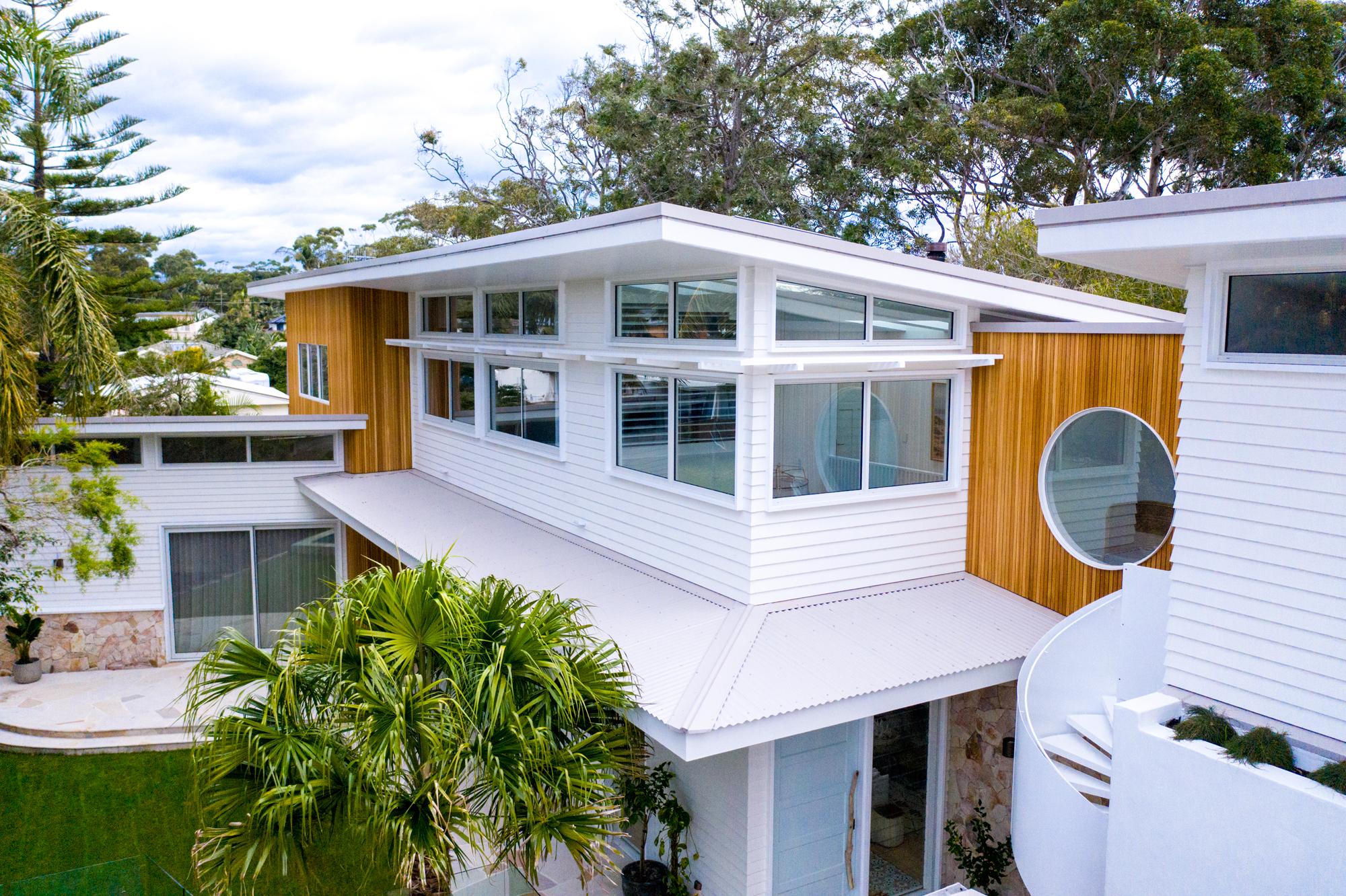
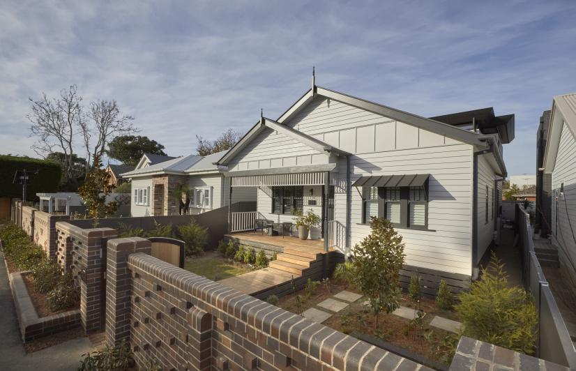
CAPTION: COLORBOND® Ultra steel roof in Dune®.
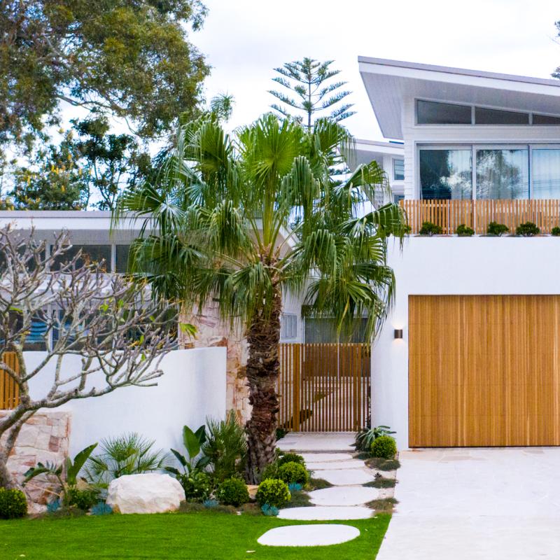
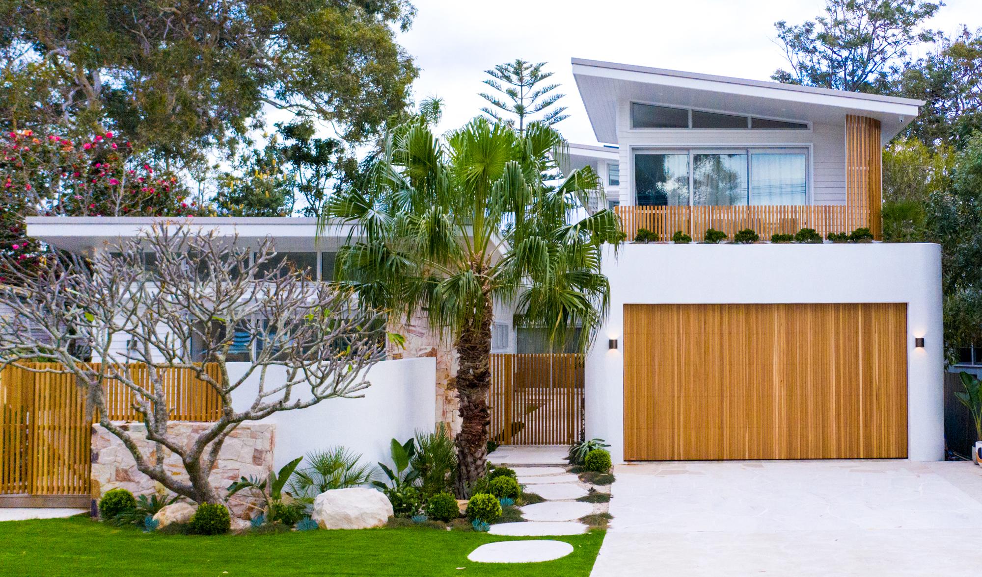
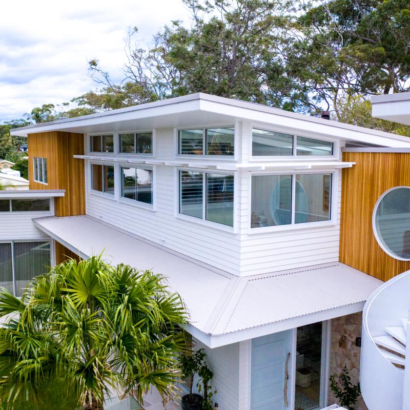
Kyal and Kara Demmrich’s Blue Lagoon Build (pictured above) was a knock down and rebuild to create their dream family home. The property is located less than 200m from the beach and is surrounded by eucalyptus trees. The couple’s colour palette - combining the warm neutral of COLORBOND® steel in the colour Dune® and the crisp whites, with pops of textured colour, reflects their laidback lifestyle, and was inspired by the coastal location and surrounding fauna.
What does your heart desire?
Have you had a picture of your perfect house for a while? Perhaps you’ve created a mood board of looks that you love? Do you have a list of wishes and dreams that you want your perfect house and its scheme to reflect? Have you got a clear mental image of every detail? Well if you do, you’re one of the lucky ones, as most people get buried in the myriad choices and suffer paralysis by analysis.
If you don’t already know what you want, one solution is to find lots of reference on Pinterest or from magazines and then create your own mood board.
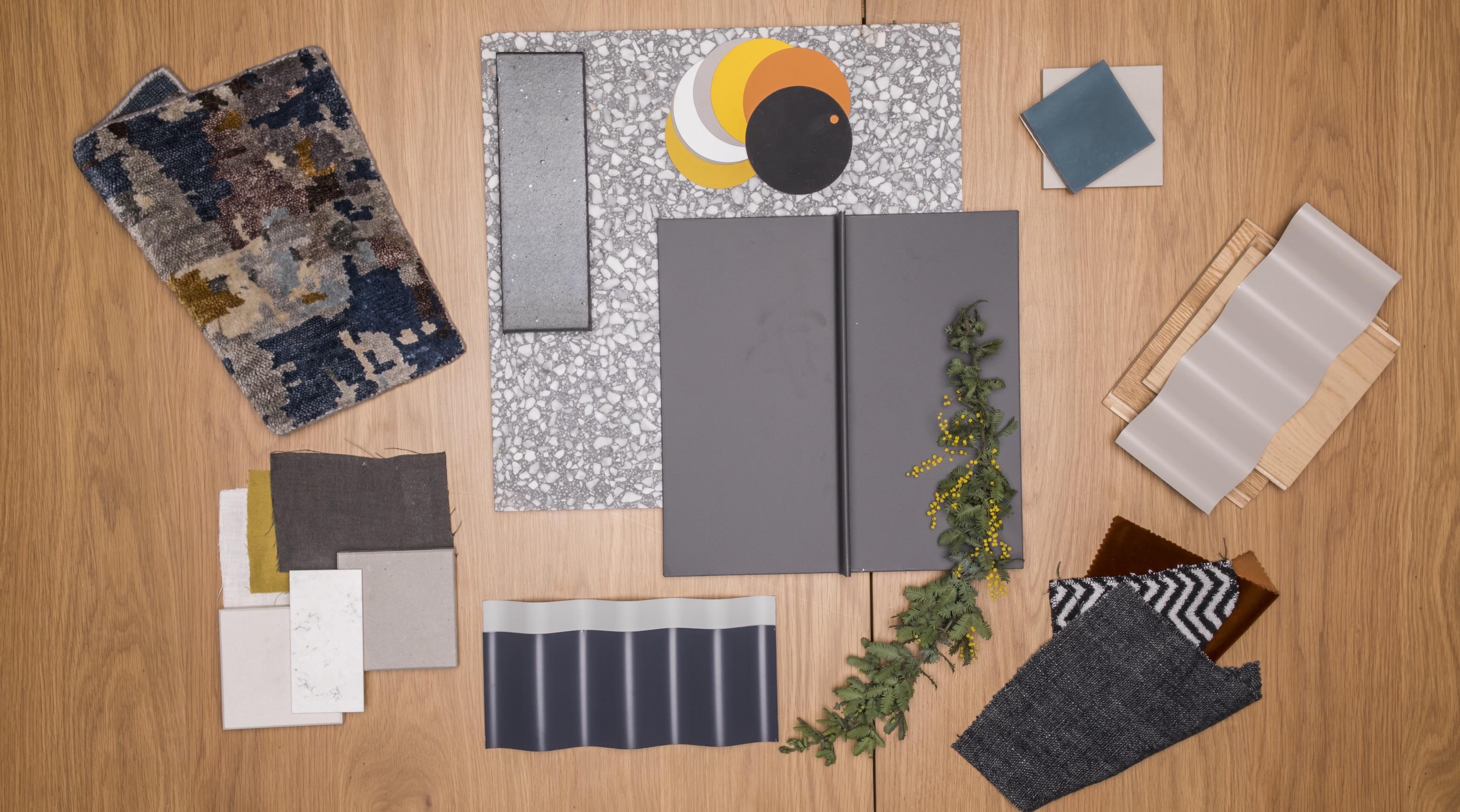
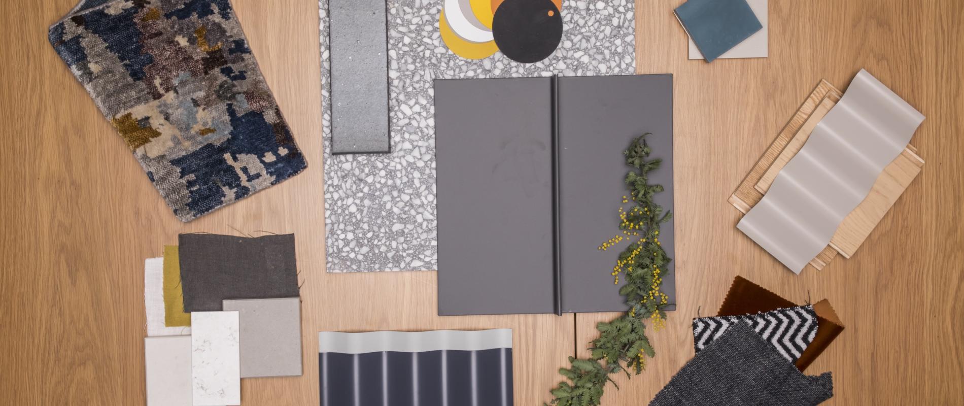
CAPTION: Creating a mood board is an essential step
This mood board started with the largest part of the build – the roof colour and cladding. Then the trims and from there the materials which will combine together to blend or contrast: Timber to add warmth, a strong smooth dark brick to tone in with the roof. This is a strong foundation for added touches such as a modern tile or pavers. The materials or colours can then be repeated to flow into the interior palette.
Of course, don’t forget your view; if you’re lucky enough to have one, as the inspiration could well be right there in front of you. Anything and everything can be included in the first stages of your reference gathering, but the key to being focused rather than having a scatter gun approach with different things you like all jumbled together, is to first look through your reference for common features and themes. Start with one large element such as roof profiles and colours, wall colours and materials, architectural shapes and forms, period and style elements, or landscaping and exterior detailing. Take note when any of these consistently appear in your reference collection; their presence is telling you something! Sorting through and removing the things that you don’t love or obviously don’t fit (and even putting them in another board or scrapbook) is also a way to help edit your selections so you end up with a concise visual guide.
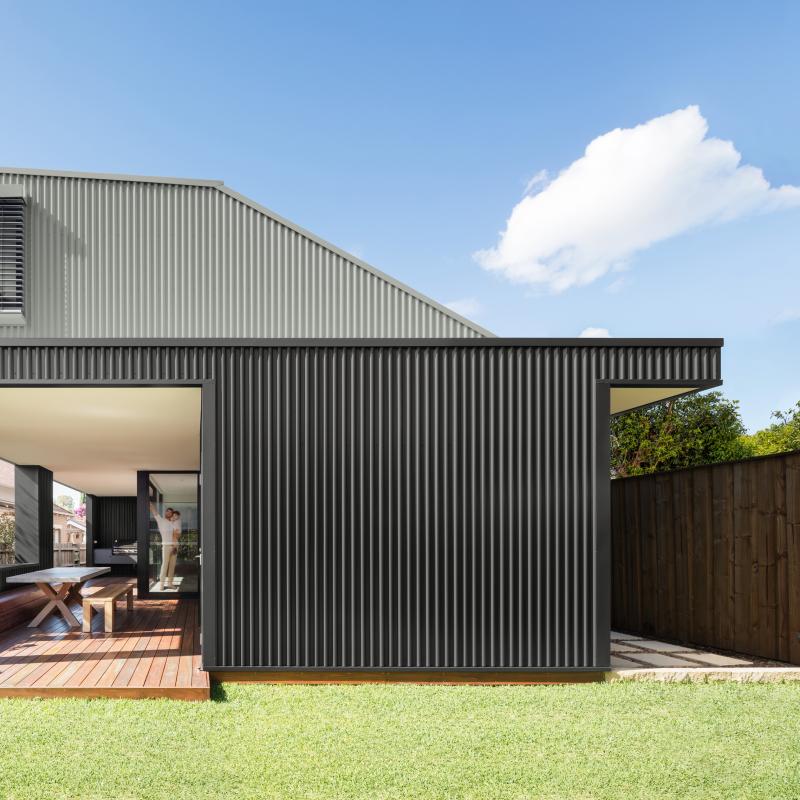
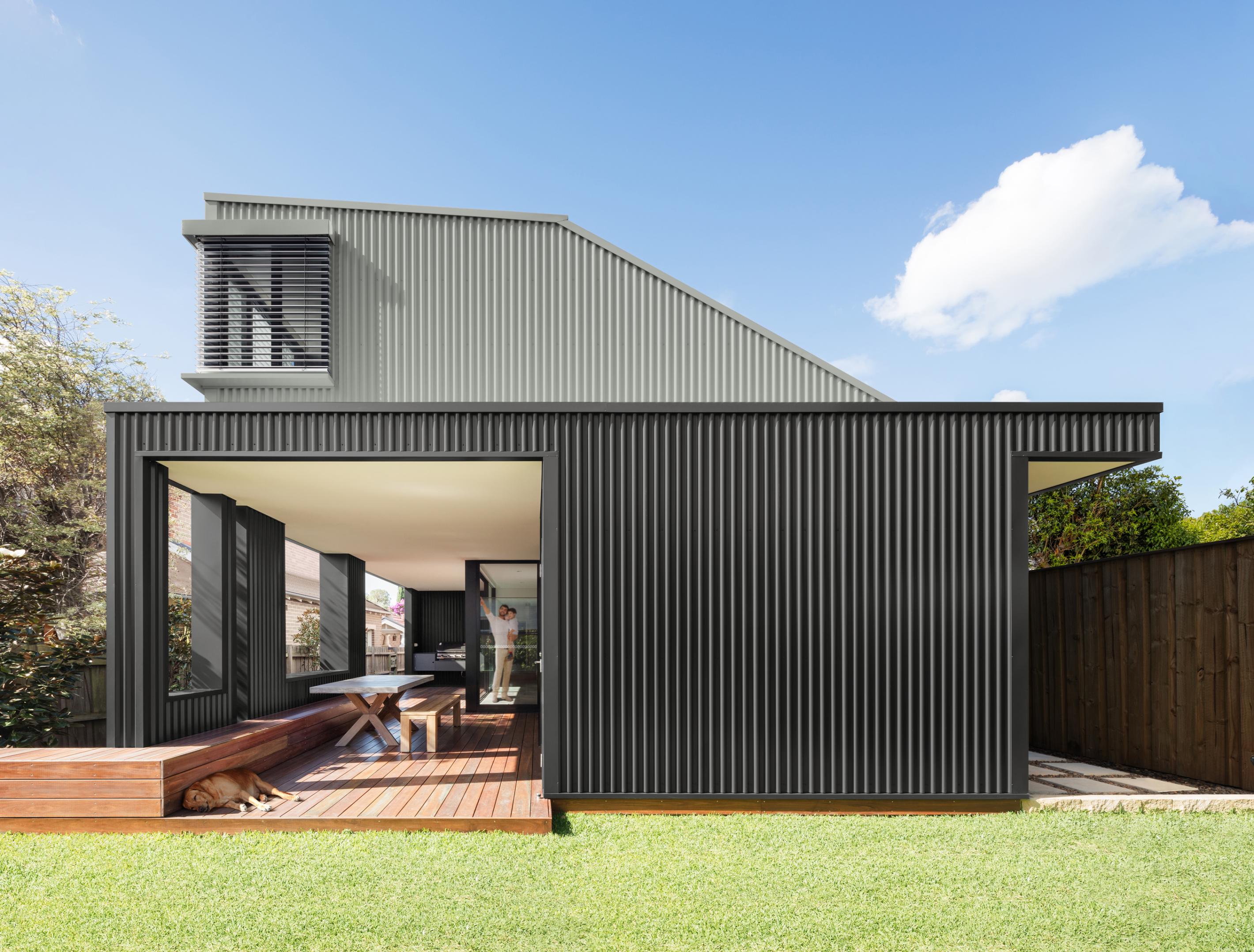
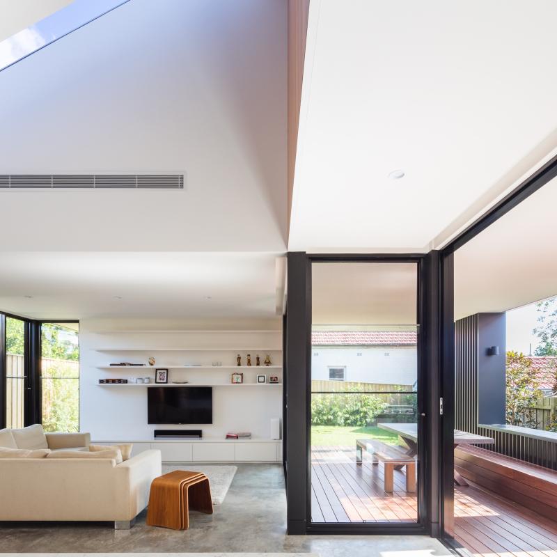
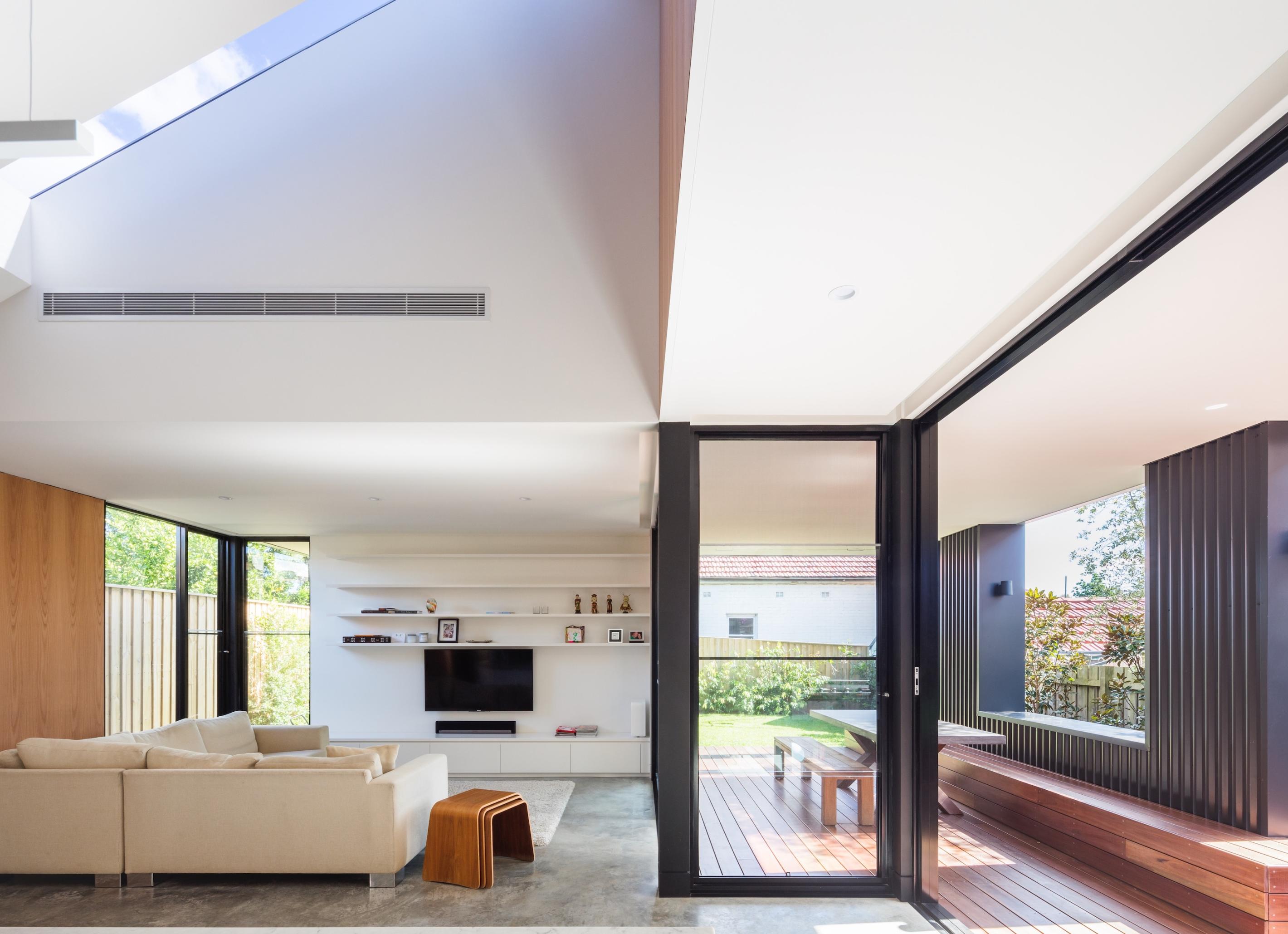
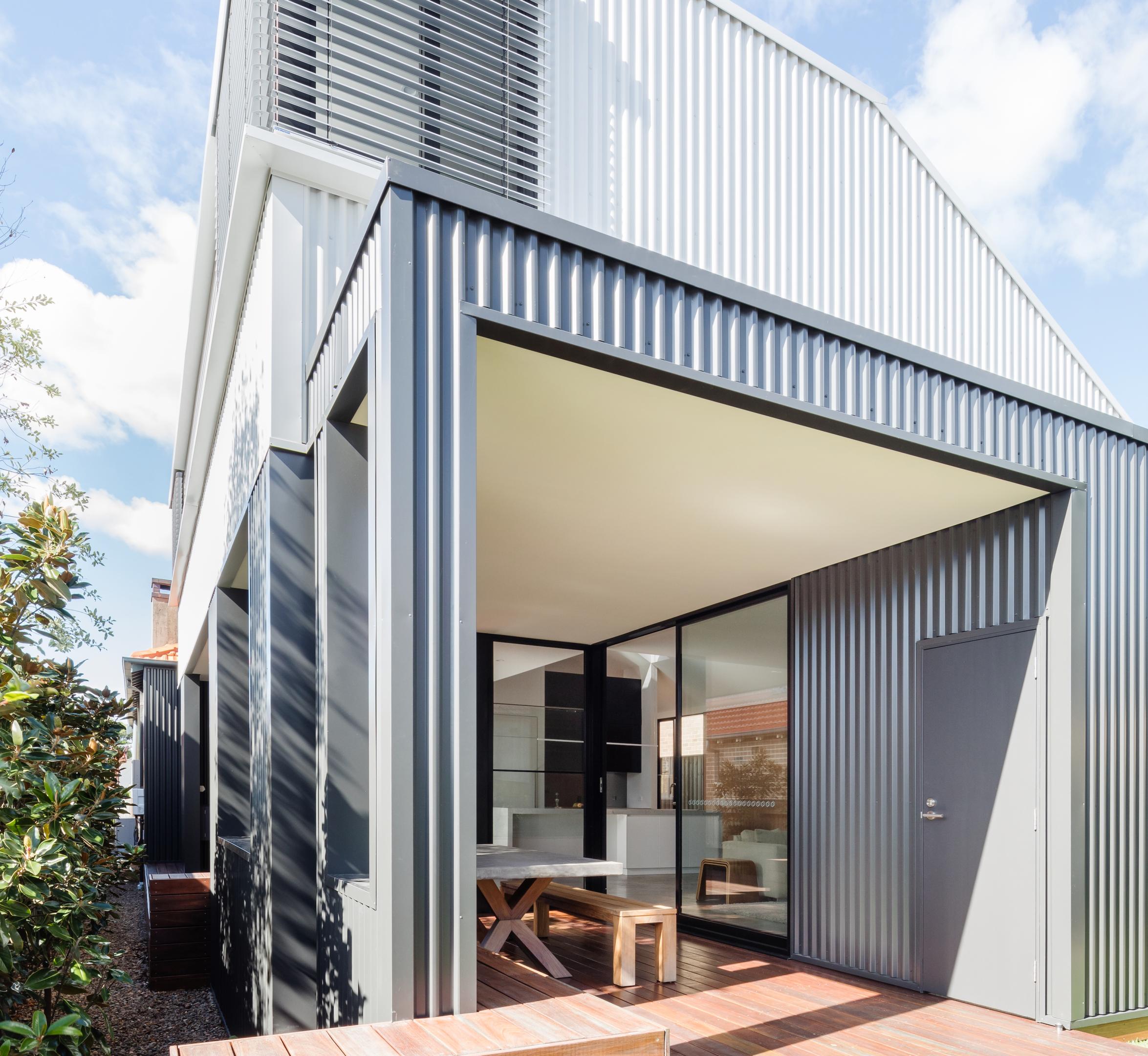
CAPTION: COLORBOND® steel in Shale Grey™ and Monument®
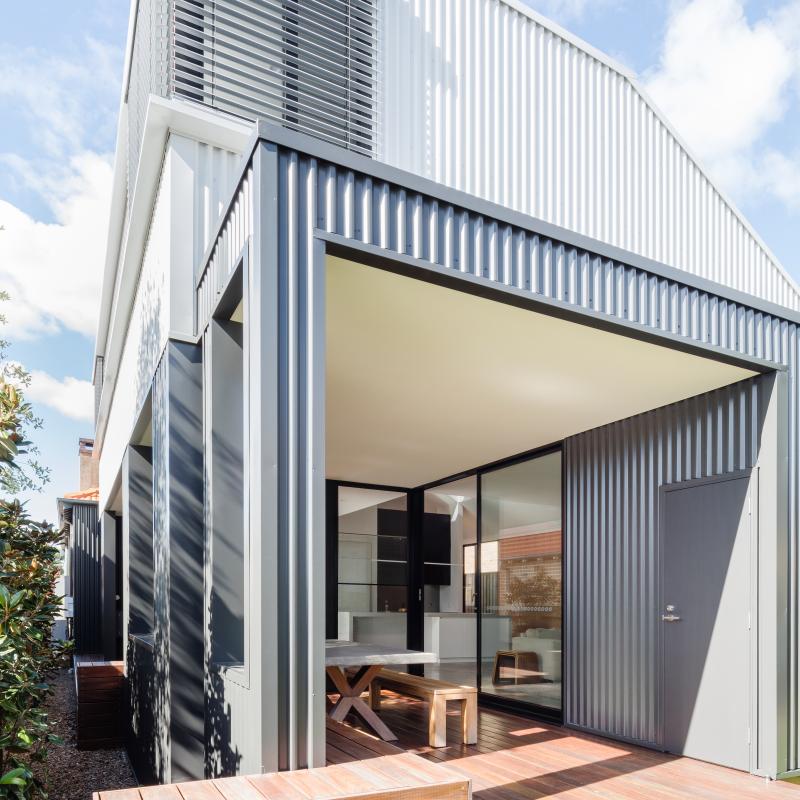
If you are building a room that opens completely to the exterior, all of the colours and textures need to work together. Croydon Street House by Ben Giles Architect (pictured above), has a seamless continuation of a simple, and contemporary colour palette and modern textures from outside to inside. These selections also further highlight the unusual angles and architectural form of the home.
Where do I start?
The best place to begin is with the features you least want to compromise on. These are often the larger design decisions such as roof materials and shape or wall cladding profiles and colours, even the garage door; the visually impactful elements that quickly define your home’s style . A roof or wall, for instance, in COLORBOND® steel Surfmist® Matt quickly sets a stylish and contemporary tone that can inspire other choices within your palette. Timber offers another layer of options; it can be stained in any number of nuanced variations, while different species can provide textural interest and contrast brilliantly with steel or stone. Paving tiles are relatively adaptable as well, and paint, of course, is almost limitless in its ability to work with the scheme of your home. These few but critical decisions that dramatically affect your home’s personality are the ones you should lock in first.
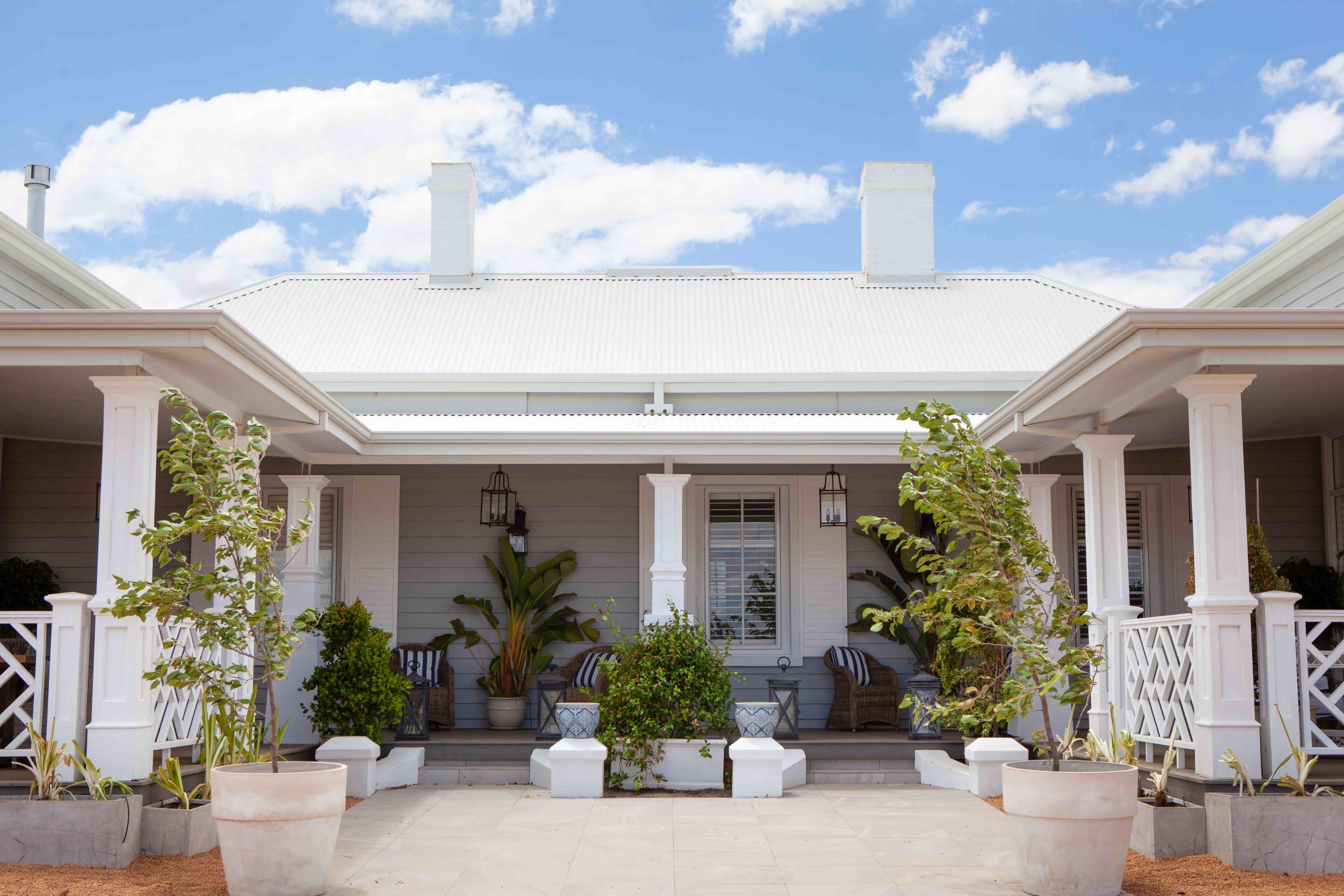
CAPTION: COLORBOND® steel Surfmist® Matt
On their Hamptons Farmhouse project (pictured above), the designers at Indah Island knew that their roof would be highly visible and started with this colour selection first and worked their way down. This “white and grey” palette is complemented with touches of blue to form a classic Hamptons style that has been continued throughout the interior of the home.
How do I know what I want is going to look good in real life?
Well, you don’t. You have to get as close to a predictable and successful result as possible by studying details like paint chips, roofing colours, brick types, structural shapes, colour and texture and window profiles. If you have a feature coloured door in mind, you’ll want to include that too. Laying all your material choices out on a flat lay or on a board is ideal, even if you are simply scattering them on your table temporarily. You need to make sure that you see every visible exterior element next to each other to make sure they sit in harmony as part of your palette.
When you’re happy that you’ve created a palette that works, go back to your reference and ensure you haven’t just made a carbon copy of someone else’s home, but rather something with your own personal stamp and style on it; you’ll be glad you did. Make sure too that your approach still has the feeling and impact that you found attractive in your reference. If you’ve created something that truly works, others may one day include your finished home in their own reference boards as they embark on their own colour palette journeys.


