It’s true that in home design, nature is often the best starting point, however nature isn’t a constant or predictable source across our country. In fact it can be quite the opposite from one part of a city to another, let alone throughout our sweeping, sunburnt land.
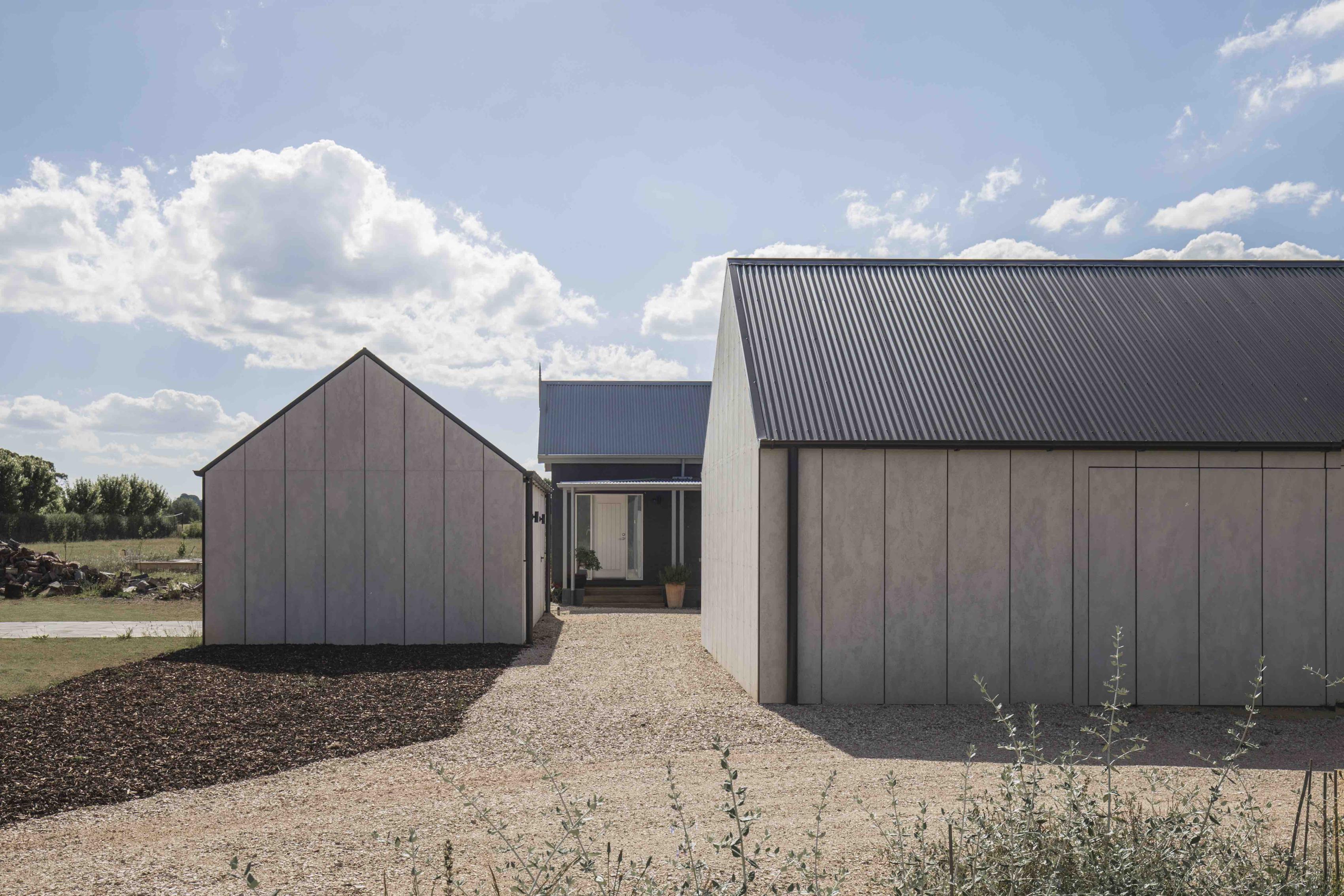
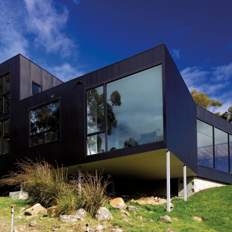
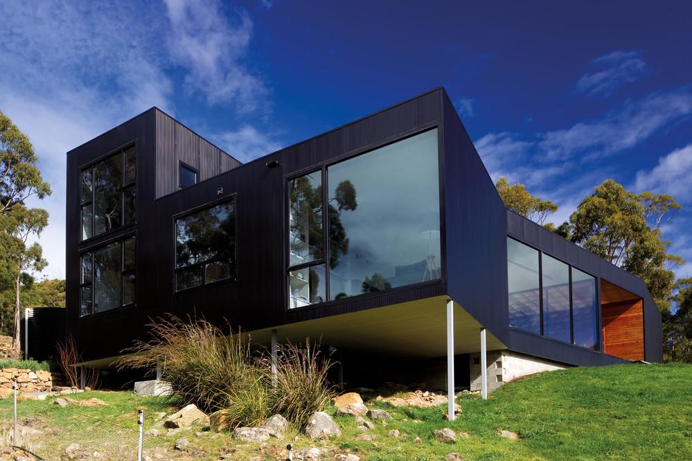
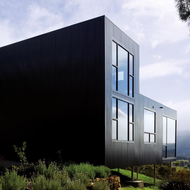
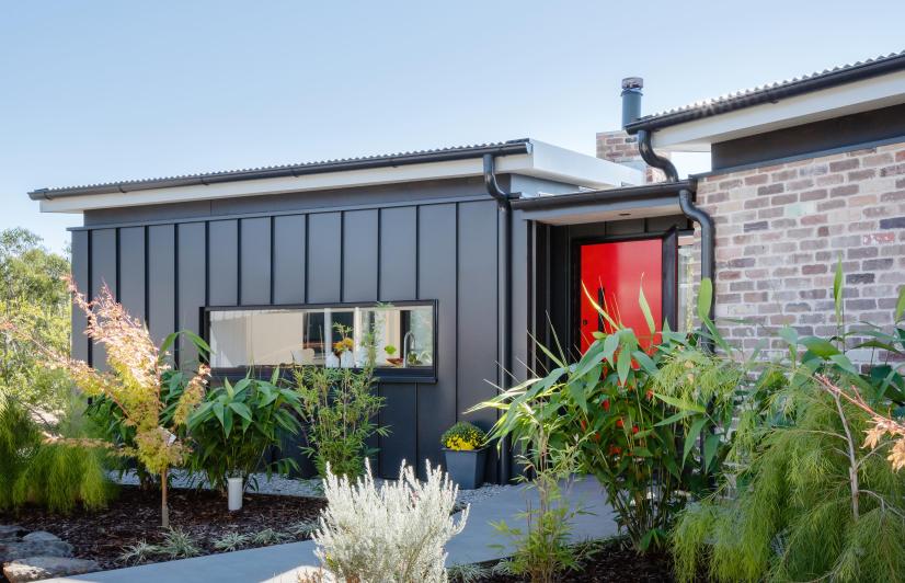
Caption: Blackwood Studio by Adam Kane Architect - Wide open spaces aren't always filled with tree canopy. Reacting to a paler, more sparse vegetation, paler mixes
Australians have long gravitated to the coastline, choosing to live by the ocean in droves. Whether it be a small beachside hamlet or a large sprawling harbour city, there’s a set of uniting factors that are common to every seaside location. Whether it’s the blue of the water, the white of wave foam, sand that can be golden, white or rainbow coloured depending on where you are, trees that grow naturally like Eucalypts or those that just feel right near the beach the way palms do, there’s a fairly consistent, if not nuanced, look and feel for life by the Australian beach.
This feeling flows through to the houses that we build close to the beachside. There’s the earthy charm of natural stone, all the better if it’s sourced close to your location. The palettes that work well are cool blue-based greys, white and charcoal. Timber looks wonderful by the sea, whether that’s teak or oak or blackened or aged grey.
If you’re looking to include roofing, cladding or both in a location inspired by the sea, the COLORBOND® steel colours that often work well are Windspray®, Shale Grey™, Ironstone®, Surfmist® and Dune®. A beach shack could use the familiar undulations of corrigated really well, whereas a more architectural house naturally lends itself to the more contemporary Standing Seam profiles.
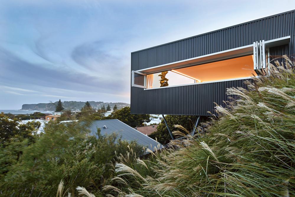
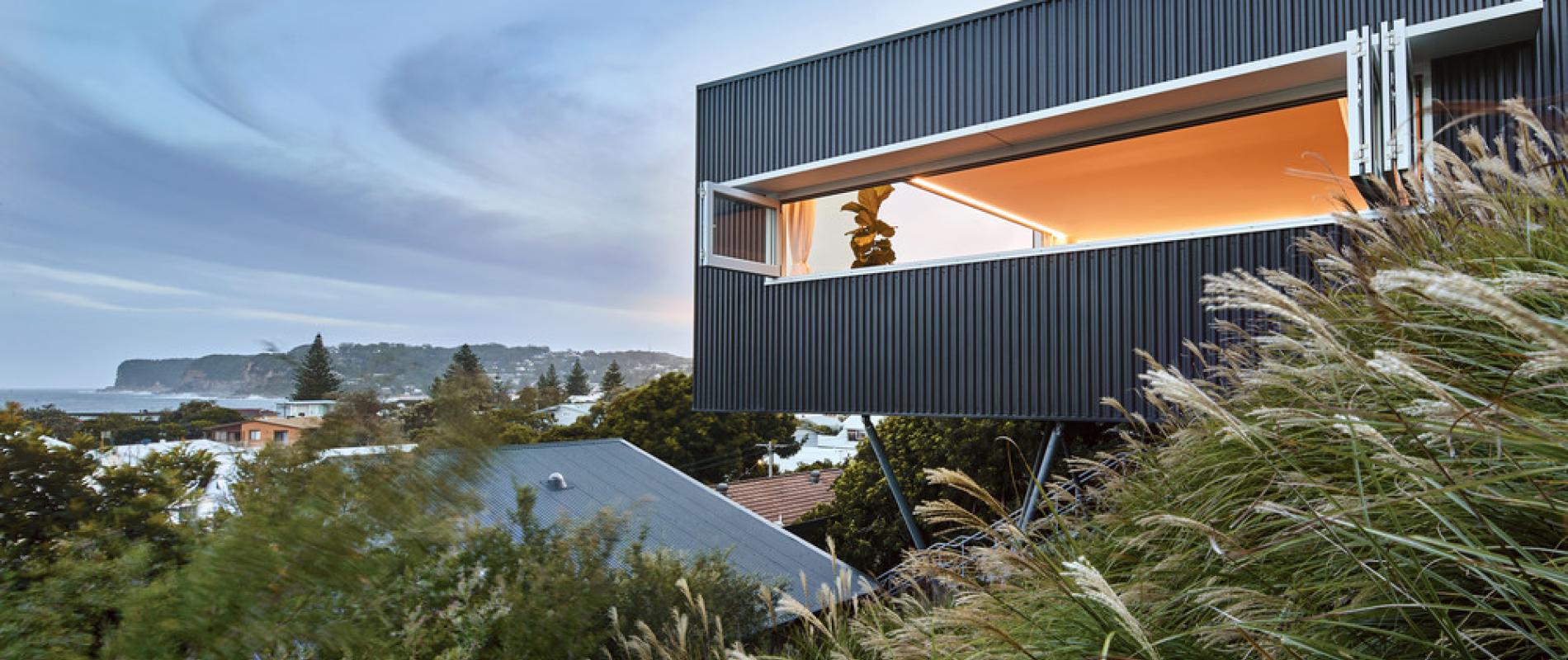
Caption: North Avoca Studio by Matt Thitchener Architects - built to extrude out over the view but not intrude. Never a better case for working with natures palette.
If your tastes are tree change rather than sea change, then there are definitely easy references to pull from so that your home sits softly within the landscape. Eucalypt colours are calming and natural. There’s nothing better to slow your pace than centring yourself around the rhythm of the breeze through trees, and the right colours on your home can conjure an immediate association with this peaceful sense.
Greys, natural beiges and neutrals, dark charcoals, light off whites as well as the green-based neutral colours borne from de-saturated grey bases all occur in our environment here in Australia and translate perfectly to a home amongst the parks and forests.
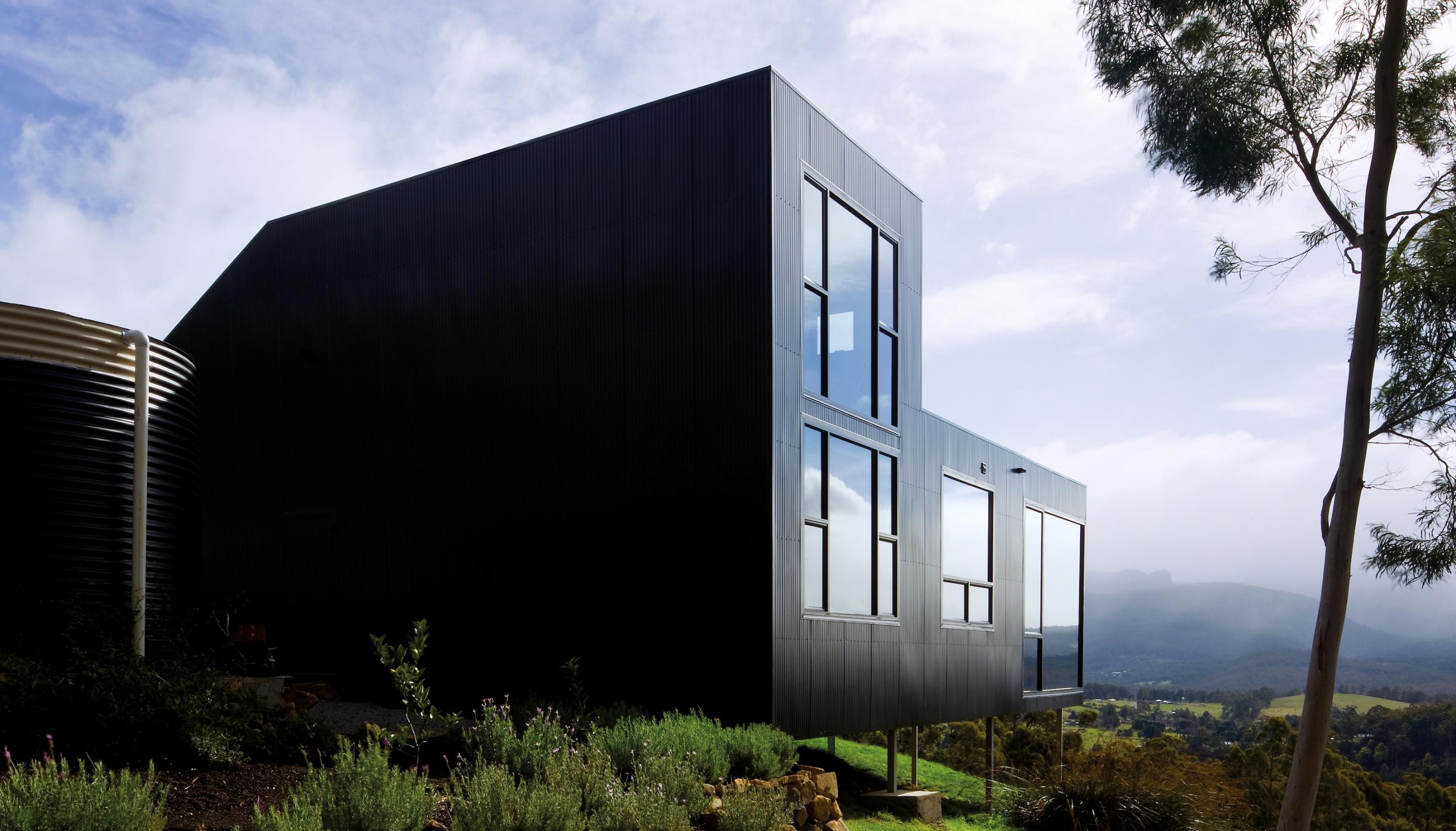
Caption: Allens Rivulet House. - COLORBOND® steel Night Sky® in a LYSAGHT profile - working to your view. The site allows a heavier hand in colour
Natural timbers in your home’s selection might be darker or more aged. Ironbark, blackbutt and spotted gum all work as part of your timber palette. Stones may be darker, whilst again, looking for what occurs naturally in your area is wise, while there’s never any harm in providing some cut through with a sharp white or black to give a natural scheme the life it sometimes needs.
COLORBOND® steel in these locations can look perfect in Wallaby®, Cove®, Evening Haze®, Pale Eucalypt®, Woodland Grey®, Gully®, Jasper® and Ironstone®. The overall palette is more important than the parts, though choosing the right colours and materials is integral in making your home fit life in the treetops.
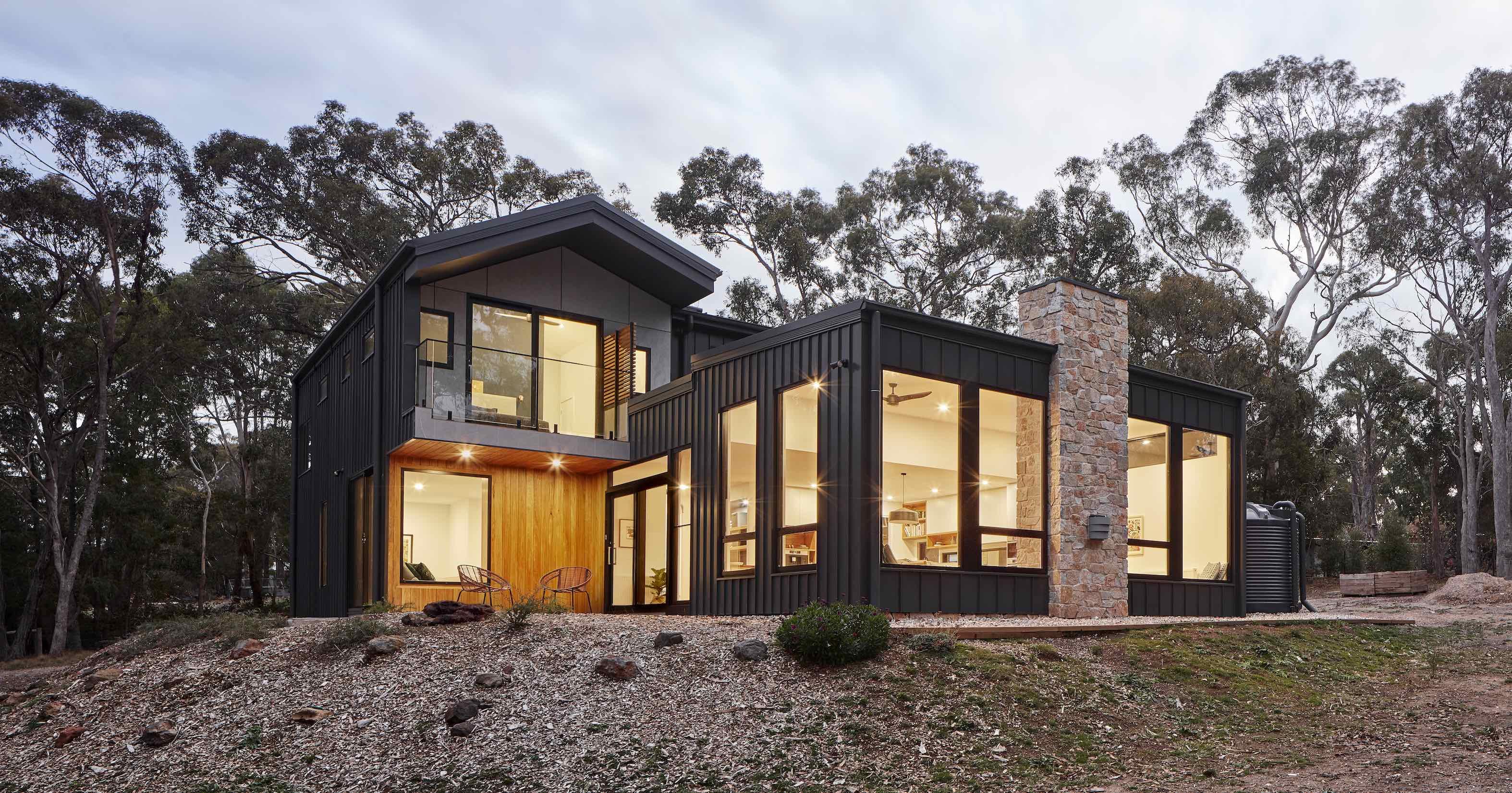
Caption: Macedon House (Happiness Home) by Glow Design - drawing from natures palette, mixing the materials so there is an organic nature to fitting into the landscape
From lush greens to the red earth of the heart of our country, rural homes require a different approach in colours and materials. Country doesn’t have to mean traditional, though an Aussie homestead is certainly a thing of beauty and splendour. Red brick can be a gift in any location where natural surfaces turn red when the sun settles on them, while lighter brick can also be an appropriate choice, as too can greys within the spectrum.
COLORBOND® steel in a corrugated profile is an almost ubiquitous choice with older homes, but as with any location, these traditional forms can be enriched and enlivened simply by substituting with a contemporary Standing Seam profile whilst leaving your other colour and material choices intact.
Rural homes can also be architecturally driven and striking, especially due to the gift of space to allow a home to sit heavier on the land and create volumes of area that are as vast as the wide open lands beyond their walls.
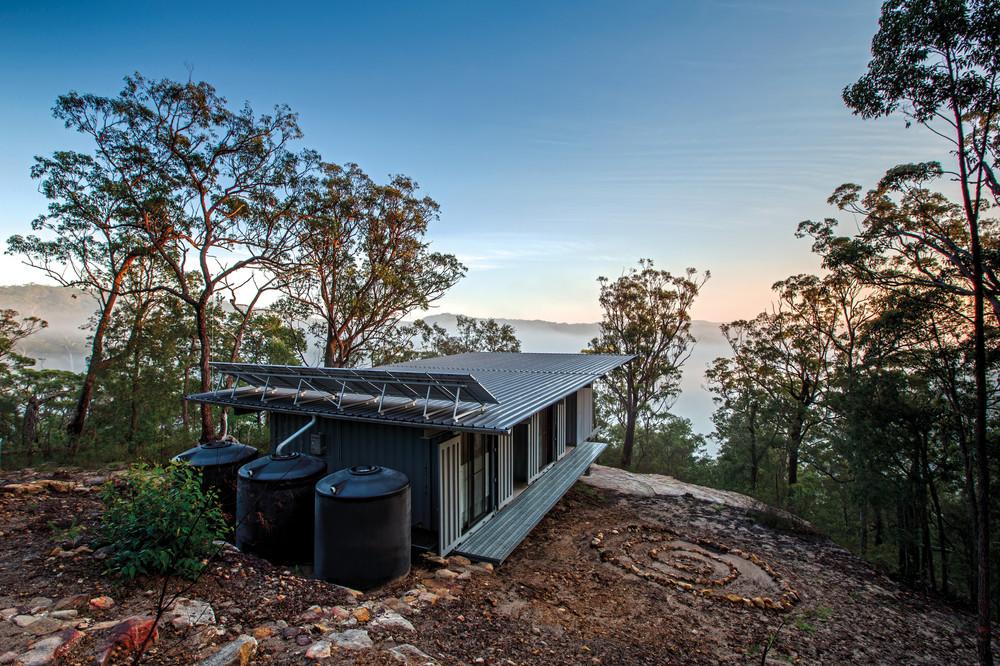
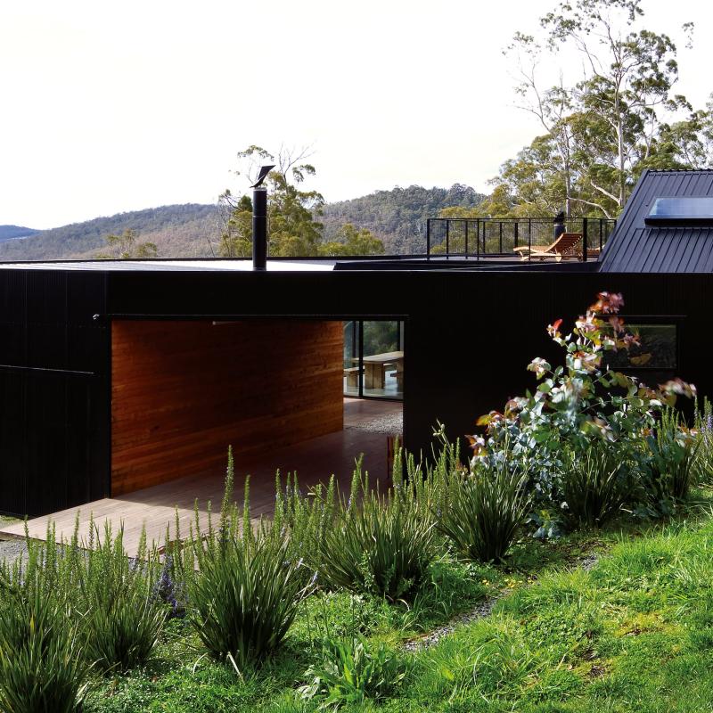
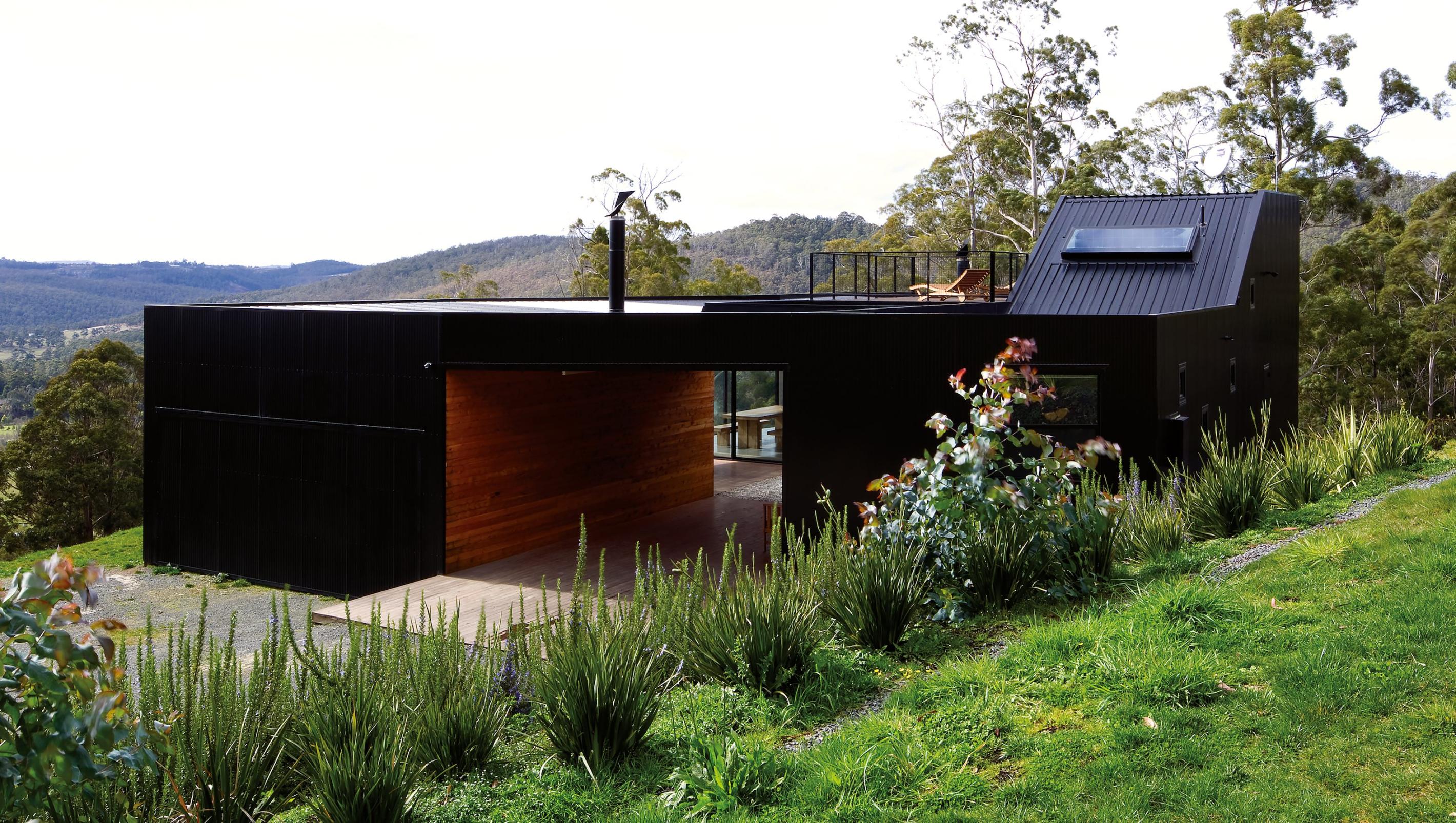
Caption: Outpost by Drew Heath - when it's about the view and being one with it while still maintaining the practicalities of living in the bush
Contemporary palettes look amazing in these sorts of larger reinterpretations of the traditional homestead, with blackened timbers, red brick and dark roofing and wall panelling looking as good here as it can in an industrial landscape.
If you’re looking for a few safe choices to fit within a rural environment, consider the COLORBOND® steel colours Wallaby®, Cove®, Evening Haze®, Pale Eucalypt®, Woodland Grey®, Gully®, Jasper® and Ironstone®.
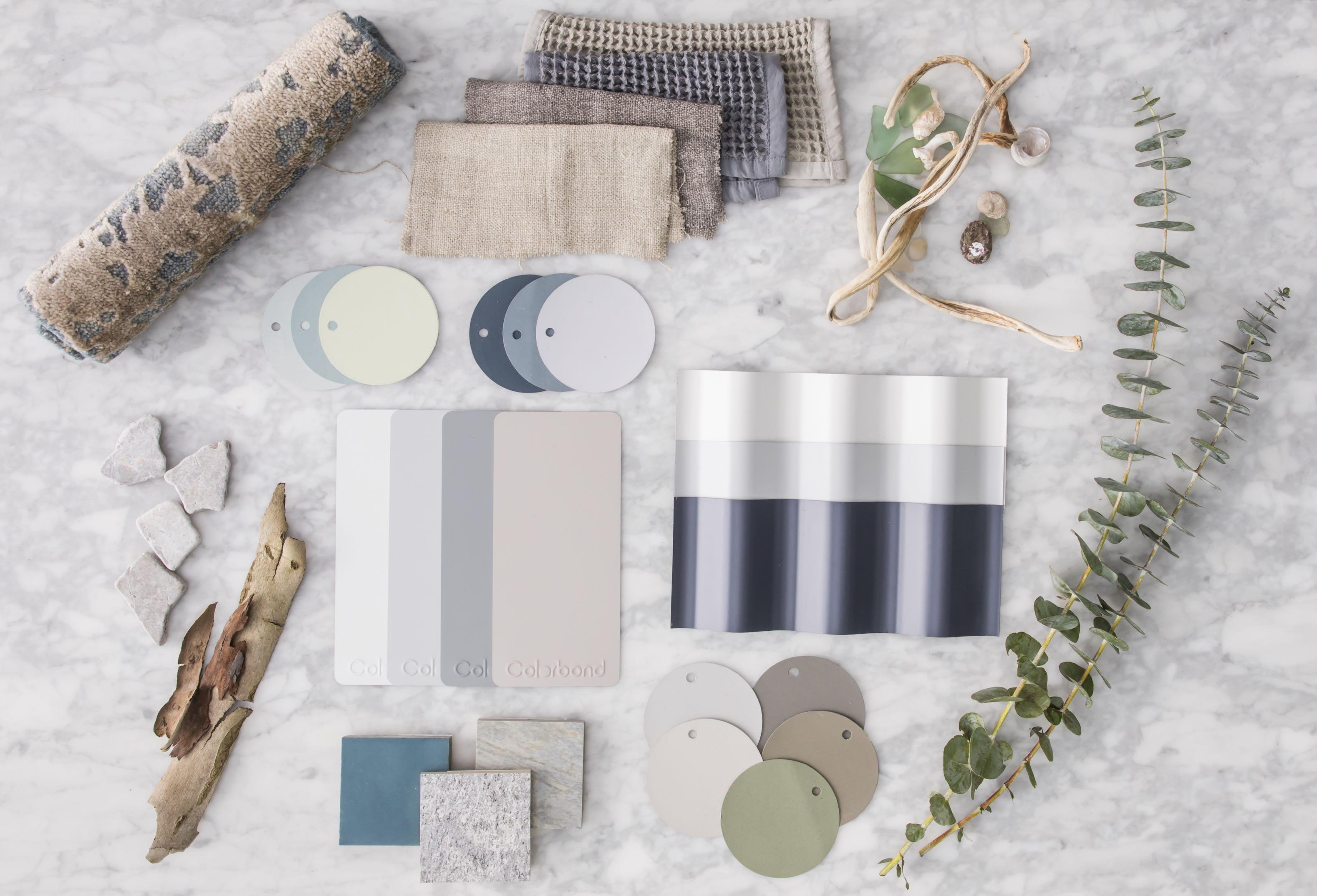
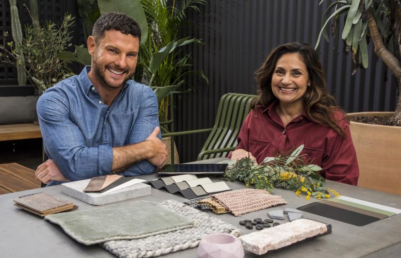
Playing with your palettes and working them out as part of a mood board or flat-lay is a great start. Taking that flat-lay into the location you intend to build is even better and comparing the colours and materials you’d like to use with the features that are in your view or the local setting of your home will give you the most confidence that you’re creating a cohesive effect.
There will always be new choices of exterior finishes, but taking the landscape as inspiration and working that into your colour scheme and materials and finish selections will make for a home that is perfectly, and naturally, inspired.
