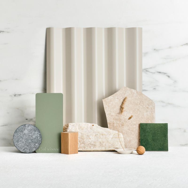
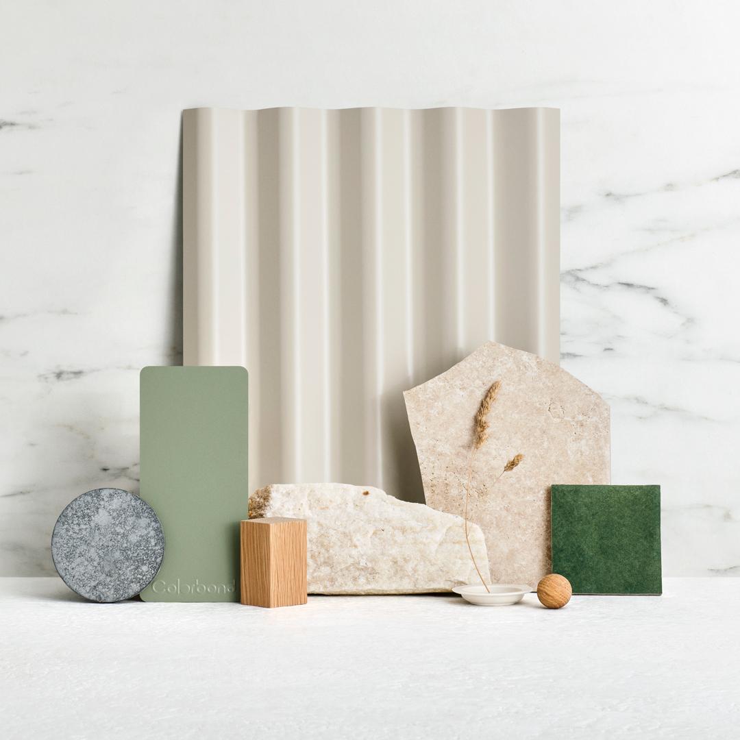
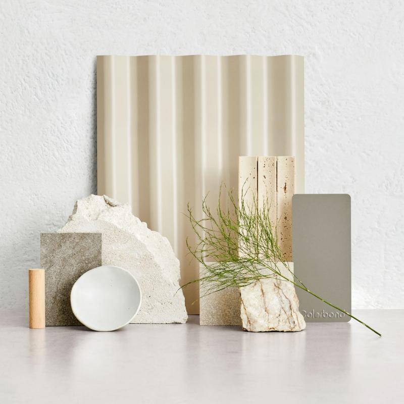
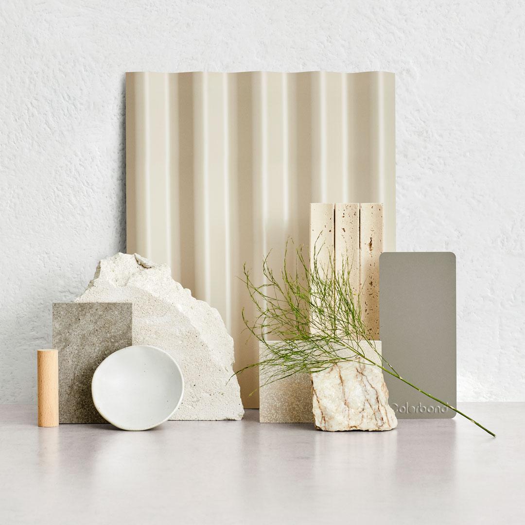
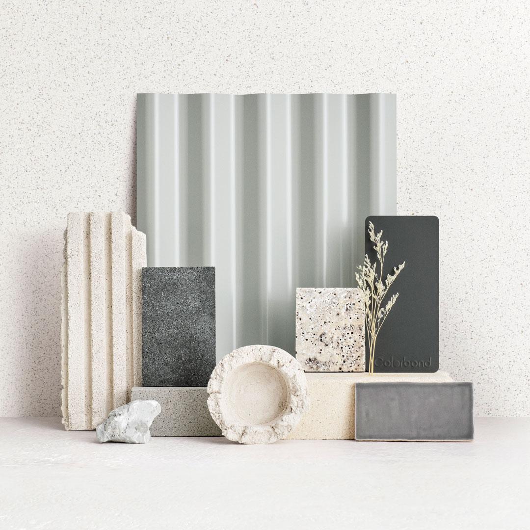
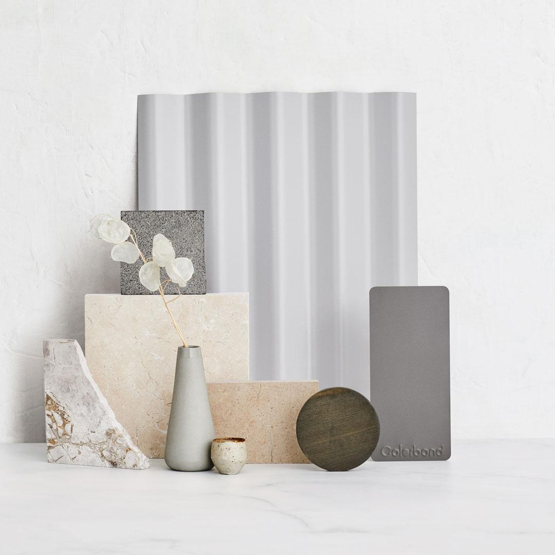
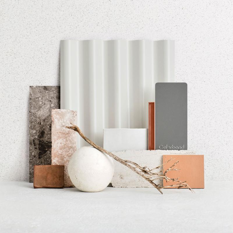
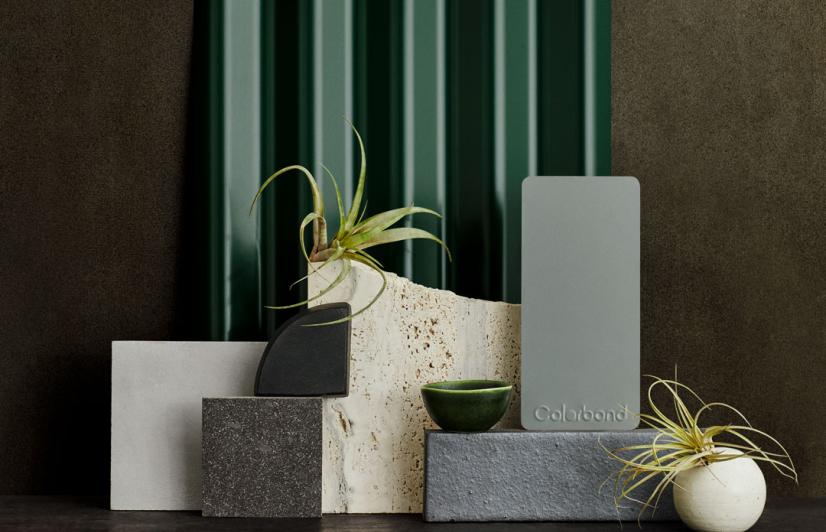
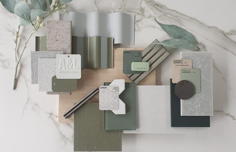
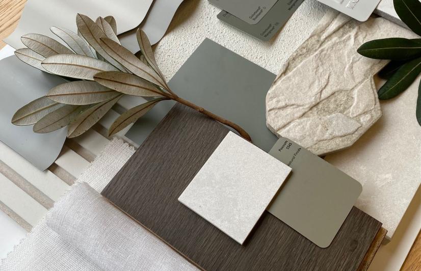
These pale tones are naturally inspired, light and equally at home on contemporary or heritage buildings, providing an ideal base for dramatic contrasts in both colour and material. Choosing COLORBOND® steel in these paler tones helps to create cooler roofs that may help make a difference to the energy efficiency of your home and may contribute to cooler local environments.
The pale tone colours in the COLORBOND® steel palette are
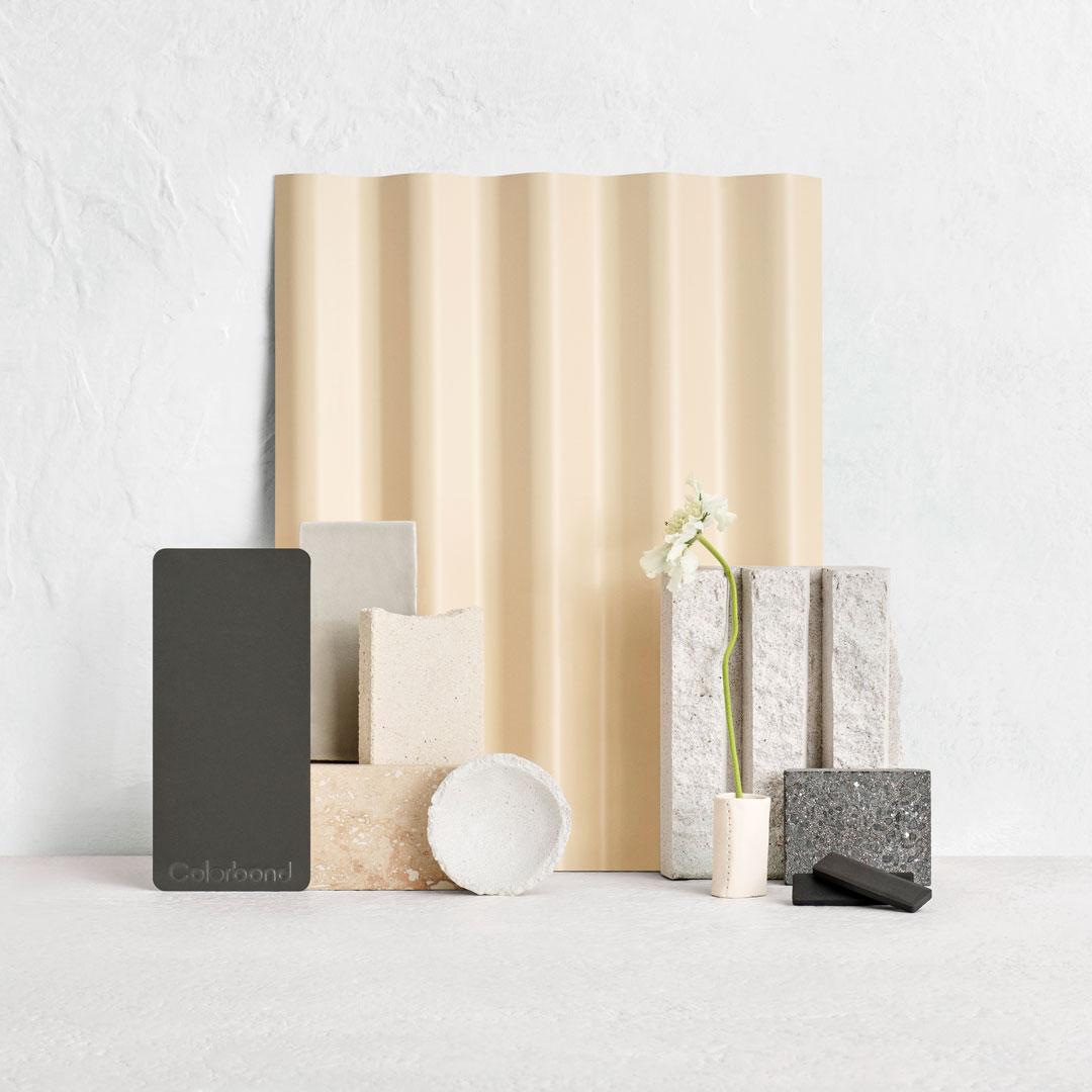
The warmth and cosiness of Classic Cream™ is a steadfast part of traditional colour schemes, but to update and balance the vibrancy of it’s creaminess, add a modern strong neutral colour like Woodland Grey® for trims. Woodland Grey® is a warm charcoal, which when combined with modern building materials such as cement and grey marble, can moderate a scheme.
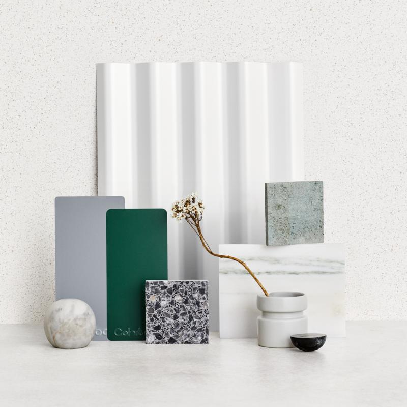
The fresh colouring of Dover White™ can sharply contrast as part of an exterior scheme. Using it with deep colours can accentuate their undertones, like the leafy coloured Cottage Green®. By using it as trim, it will be a vibrant addition to any exterior. Coupled with a Matt finish and more muted mid tone colours, such as Bluegum®, it can blend with building materials like concrete, terrazzo and pale grey marble to give a timeless elegance to modern or traditional designs.
Dune® is a warm blush coloured neutral, which as a roof can be the base colour in a serene coloured palette. A pale coloured combination mixing cool and warm neutrals may be unusual, but the use of Shale Grey™ is gently compatible when using building materials like limestone and sandstone which can have the same undertones. The palette of Dune® and Shale Grey™ in a Matt finish will be at home on coastal designs, or an urban bungalow or skillion roofed retro design, with a nod to our sun-drenched coastlines.
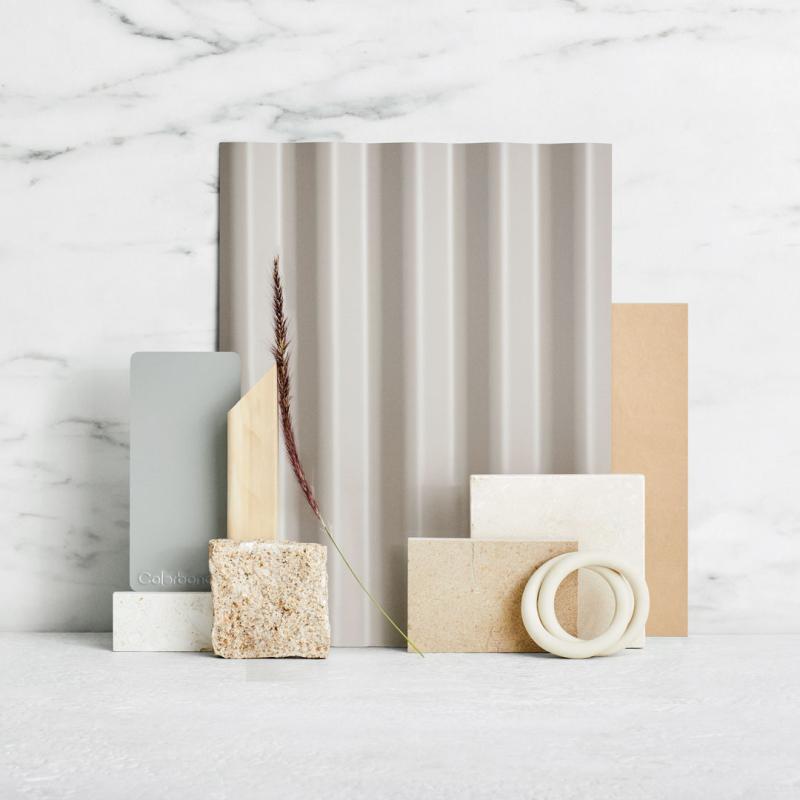
The soft pale tones of Evening Haze® give unity to earthy coloured material combinations. The palette mix of limestone or sandstone and paler blonde timber accents, enhances this beautiful grounding colour. As a roof, it can be used in a tranquil combination of tonal materials, but when it’s incorporated with brighter and fresher colour accents such as, Pale Eucalypt® and flowing into interior finishes, it can give a contemporary warm elegance.
A cool neutral grey colour to launch a pale scheme is a universal go-to. Adding the slightly grey warmth of pale cement, grey marbles and tiles gives a little more diversity to palettes using Shale Grey™. Using a deep bold colour like Monument® in a Matt finish for the trim can give a modern elegance and depth in a monochromatic material scheme.
The pale warm undertones of Southerly® give a subtle inviting charm to any colour scheme. If you have used building materials such as pale timber and natural stone like travertine and terrazzo, it will lend its pale grey whisper of colour to work alongside stronger warm colours as an accent. Using colours such as Wallaby® can allow the warmth to come alive and give depth to the scheme. Colour and materials inspired by nature will enhance the versatility of this pale cosy grey.
Used as a hero colour or trim colour on many coastal schemes, Surfmist® provides a slightly earthier white when coupled with warm earthy mid toned greys, like Wallaby®. This allows a more urban palette to be produced, so you can use the rawness of a reclaimed or limewash brick to give you a modern twist to industrial or brutalist designs. Find your accents in robust coloured materials or blend with layering of similar coloured bricks and tiles will provide a textural difference.
View more inspired homes
We love to showcase examples of COLORBOND® steel being used all over Australia - in many different applications, and home styles.
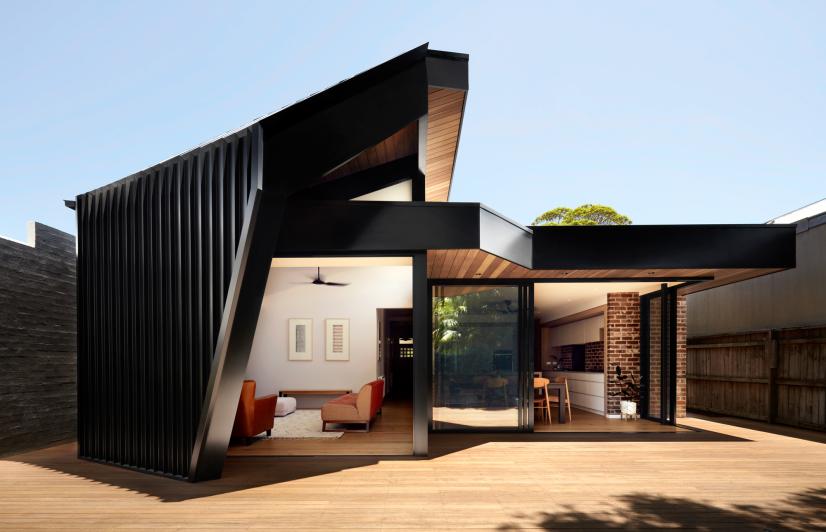
Deep tones, bold and dark, are increasingly popular in both urban and rural locations.
A calming oasis inspired by the textures and colours of world around it.
This homage to the Gold Coast’s beach shacks of the 50’s has colours and textures inspired by the area’s native Banksia trees.
